Developing digipaks and homepages for Idea 2
Ben Howard is an up and coming artist, who's focus is mainly on the music rather than the star image. He is a synthetic act, and his album and homepage designs reflect this anonymity behind the music.

The Digipak for Howard's latest album 'I Forgot Where We Were'. The cover features only himself on it, the first album cover of his to have that. Yet, there we can only really see have his face. This album cover reflects his star image. He is not quite a star, but up and coming. His focus is still on the music but has increasing popularity with his target audience. If I were to see this CD cover in the shop I would think of it to be of an indie alternative genre. Furthermore, the title and artist name is hidden in the corner of the cover. This subtlety tells the audience that he is a synthetic act, as he is not making an obvious effort to brand himself and his music.
 The design is simplistic and neutral. I like how he doesn't need any massive labelling or design to sell his music. His unique selling point is that his style is so simple and relaxing. This design matches his style of music.


These are designs from older albums, instead of featuring himself feature drawings and photographs. The theme around these designs are old vintage looking. They also relate to the album title (Black flies, Old Pine etc.)
With my design, I would want a simplistic design, that connotes the passion for the music instead of the star image. I particularly like the drawings and the neutral tones of the images. The greys and blacks give a soft and relaxing mood. These images are clearly from an indie synthetic act.
My favourite album design by Ben Howard is for the Burgh Island. It's composition fills the cover with parallel lines, the design is so filling yet so simple and clean cut. The breaking of the lines to show the Burgh Island is all the album needs to relate to the title, and show the audience that this is a chilled low key acoustic style of music.

I also looked at some similar artists such as José González and Damien Rice, who are also acoustic indie male singers.

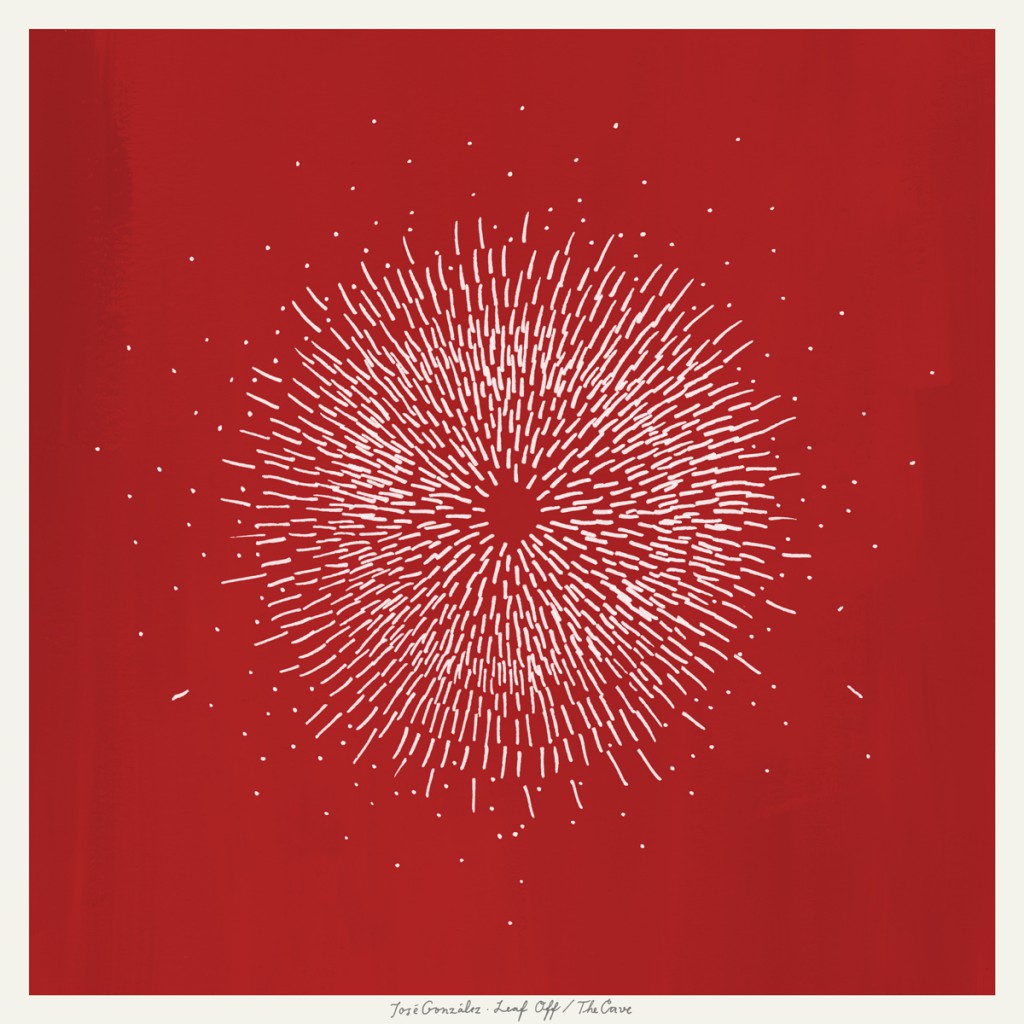
I particularly love these designs and how simple they are. In terms of album covers I believe Less is more when displaying something of the indie genre. The design must be simple and soothing to match the simpleness and calming music it goes with.


 I then stumbled across this pianist/photographer's website Alex Kozobolis. Although this is a combined website showing his different platforms of work, I really liked the design of this page. The logo is neatly in the corner, the stunning photos shuffle randomly. The page simply showcases the work of the artist and doesn't push information in the viewer's face. This is similar to Howard's design.
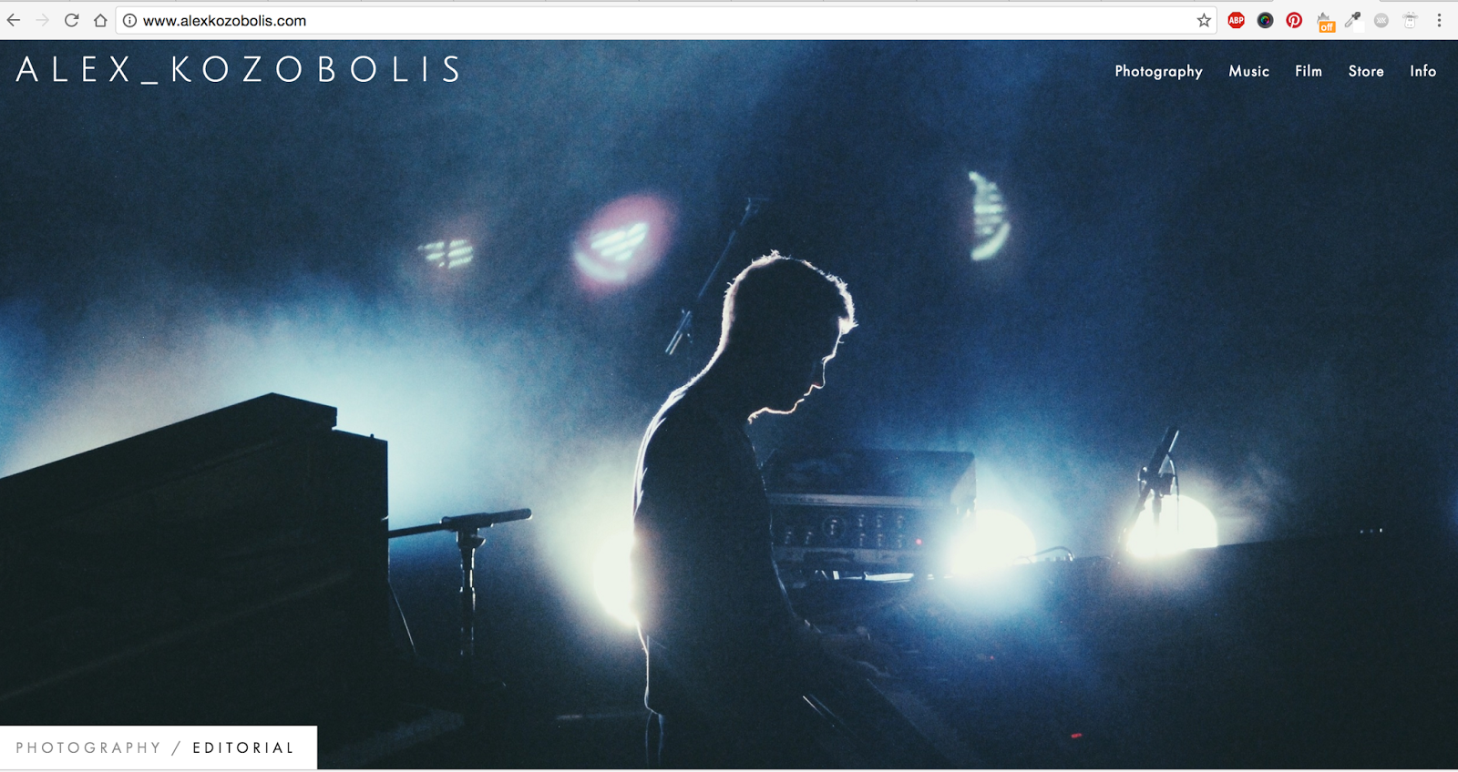


Tags:
a2


0 comments