Creating a website: DNCE
I decided to create a website based on the existing band DNCE. As they are newcomers, they so far do not contain any merchandise or sales online. I chose DNCE as they are a colourful and stylish pop band.
I was first given the choice of different templates, in which i chose a simplistic but modern and animating design. I believe the technical conventions of this websites should be very simple and fresh as they are just starting out. There is no need to clutter the website with unnecessary information.
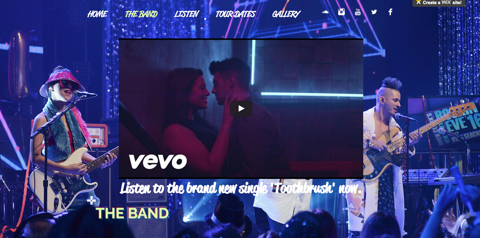
On the front page I wanted to introduce their signature photograph of them holding the balloons. It is a minimal and refreshing background with pops of colour, which hold technical conventions of cleanliness and refreshment in the music industry. As I experimented with text, I found the 3D feature to be quite appropriate for the technical conventions of the website. I used this 3D styling as a recurring feature throughout the website. I also chose two recurring fonts: Reklame Script and Raleway. The Reklame was used for the title and the navigation bar and some pieces of information, whilst the Raleway was used for more official links such as buying tickets and listening to their songs. Again, I only used two fonts so the website was not cluttered and in a sense, the Reklame became their signature font.
As the band are newcomers, it would make sense for their album to be uploaded to their website. They are not popular enough yet to have all their songs exclusively to buy before listening only. Their songs Pay My Rent and Jinx in particular, are free to listen on Youtube. I converted the youtube files into mp3 and uploaded the songs onto the wix album player. I also linked videos and itunes to what they feature in such as Grease Live!
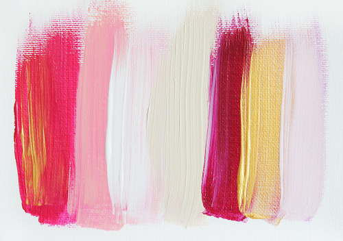
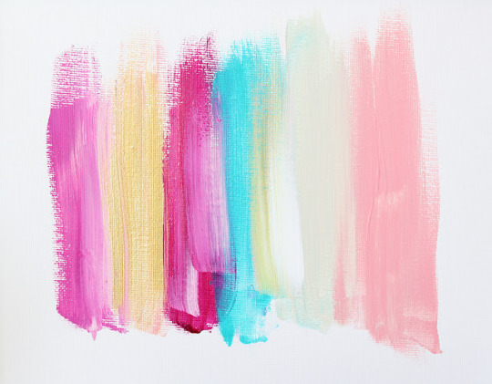
I wanted to convey the symbolic conventions of modern cleanliness, but also flamboyant colour and a sense of fun. I particularly wanted to aim this website towards a younger target audience, through the bright colour palette used in the titles and the colourful backgrounds.
I used an online eyedropper tool to extract the hex codes out of these colours and applied them to the websites text.
I also chose the parallax scroll feature where the you see the background once scrolling down from the information. This technical convention connotes a sense of modernism, as this feature is slick, fun and animating. It is rebelling against the traditional website in which I believe DNCE to be doing against the current music ideologies.
I incorporated their new single 'Toothbrush', to target the audience into getting sales. DNCE is both organic and synthetic, with Joe Jonas putting the band together, but signing a deal with Republic Records to construct their star image. In which case, a synthetic website would normally immediately introduce the viewer to their products.
I think I have applied Dyer's star theory in constructing them as an image for the audience. The target audience already know Joe Jonas from the hit band Jonas Brothers, and therefore he is the leading star that should be presented. I used images as backgrounds for the audience to see the band in action, and added links to Itunes and other streaming platforms available to hear. I also created a Gallery in which the viewers can see what the band has gotten up to. This all builds the star image and shows the popularity/likability of the band. Therefore, it sells the band's image and introduces their music to viewers.
However, I have not applied Dyer's theory to the extent that the band have become a product. I still wanted to show the other 3 members and give some information about the band. As they are newcomers I chose not to create an entirely synthetic website as this would overload the new viewers to products that they have not yet certain on buying.
I wanted to attract a young audience with the colour and brightness of the website. The rebellion of both DNCE and the traditional website attracts more free spirited and music loving members as they are genuinely intrigued in the band and what they have to offer. I believe the technical conventions of the layouts, particularly with the funky shaping of the gallery and the colourful mise-en-scene portrays a sense of care-free and shows the audience that the band don't take themselves too seriously.
I have also included an interactive page where you can buy tickets for their tour dates and a permanent footer which allows fans to sign up for newsletters and find out what DNCE are doing next.
In order to make the information accurate, I used wikipedia, Itunes, the official DNCE website, twitter, instagram, spotify, and more for the infromation.


0 comments