Looking at Album Artwork
In preparation for our own album artwork. I looked at different conventions presented in album artworks of the R&B genre. I looked at 4 different artists: Beyonce, Mariah Carey, Mary J Blige and Drake.


The technical conventions of this album cover is a mid-close up. We can only see her torso and up. The fact that it's not a close up, suggests that the star is an image for her target audience to see. The audience wants to see her appearance and what she looks like, as she supports Dyer's Star Theory of construction: she is an image to be sold to target audiences. Albums that contain close ups generally belong to the acoustic genre.
 |
| Close up used for Adele's 21. |
Her symbolic conventions show her to be against a baby blue background - targeting the male side of her audience. She is wearing a seductive crystallised tank top, revealing and supported with diamond earrings. These conventions of diamonds are associated with femininity and fun, as well as desirable and expensive. Beyonce is wrapped in diamonds in a more rebellious and scandalous way. These symbolic conventions suggest that she is classy, and desired, but can be mischievous and flirty. The font is placed in the corner of the artwork, to not take away attention from the image. It has a retro vibe, a popular trend back in 2003. It therefore suited the current trends at that time. The overall image is bright and clean. The image is simplistic but fills the album covers. The whole digipak uses the same colour scheme, along with the same photoshoot. This continues the clean cut and simple design of the artwork, suggesting that her image should not be complicated, as it's for a younger target audience.

It is clear in the R&B genre that mid shots are used for the audience to see the artist, followed with a full wide shot on the back. In both Beyonce's and Blige's you see the same photoshoot (or photo in Blige's album) used but a different pose/shot. In a way, this continues the conventions they are trying to present, and do not need to confuse the viewer with different images. The images are very simple and clean, but fill the covers.
Furthermore, the artist and album title are placed subtly in the corner, with a more mature style of font to what Beyoncé used. This supports the idea that this cover is certainly aiming for a much older target audience.
The album contains a pink background, presenting the conventions of femininity and womanhood. However, it is a more vintage rustic pink than a baby colour like Beyonce's. This suggests that the artist is older, and a more organic act, as it doesn't try too hard to push her image to sell to the audience.


Mariah Carey's album, however, is different to what we saw from Beyonce and Blige's. Although the concept of a photoshoot is still carried through, the technical and symbolic conventions differ greatly. Instead of a mid shot, we see a long shot, exposing her full body to the audience. We then see a close up of Carey for the back of the album. She is photoshopped onto an abstract sunset, where you can see through the orange clouds to meteorites and space. These conventions, along with the title 'Me. I am Mariah' suggests that the album is about her identity, and finding herself. Unlike Beyonce's and Blige's, Carey presents a more personal album cover to her. This clearly has an element of her identity in the artwork.
However, in terms of Dyer's Star Theory, Carey is not as known as she once was many years ago. Her star image has slightly decreased as new artists pop up and become more known. It may be a possibility that she has therefore become more synthetic, as her constructed image is trying to re-sell to the audience. The fact we see her full body, in a seductive nude bodysuit, portrays her as sexy and confident, which will sell to her target audience. Likewise, in her close up, it looks like she is not wearing any clothes. This pushes the conventions of her as a feminine and admiring woman.
The composition of the horizon is bold, which really stands out and catches a buyer's attention. The symbols of her posing on water infront of a horizon and space, connotes that she is a powerful woman, almost like a 'god'. Where the sky is her limit and she is her own boss. This supports her construction of being presented as a confident and powerful woman.
In addition to this, unlike Beyonce and Blige's titles, which were placed in the corner; Carey's album title is placed in the center for viewers to read clearly. The title is important to the album cover, as it supports the concept of identity and is easy for the viewer to read. This relates back to her decreasing Star image, as she is trying to resell to audience buyers.
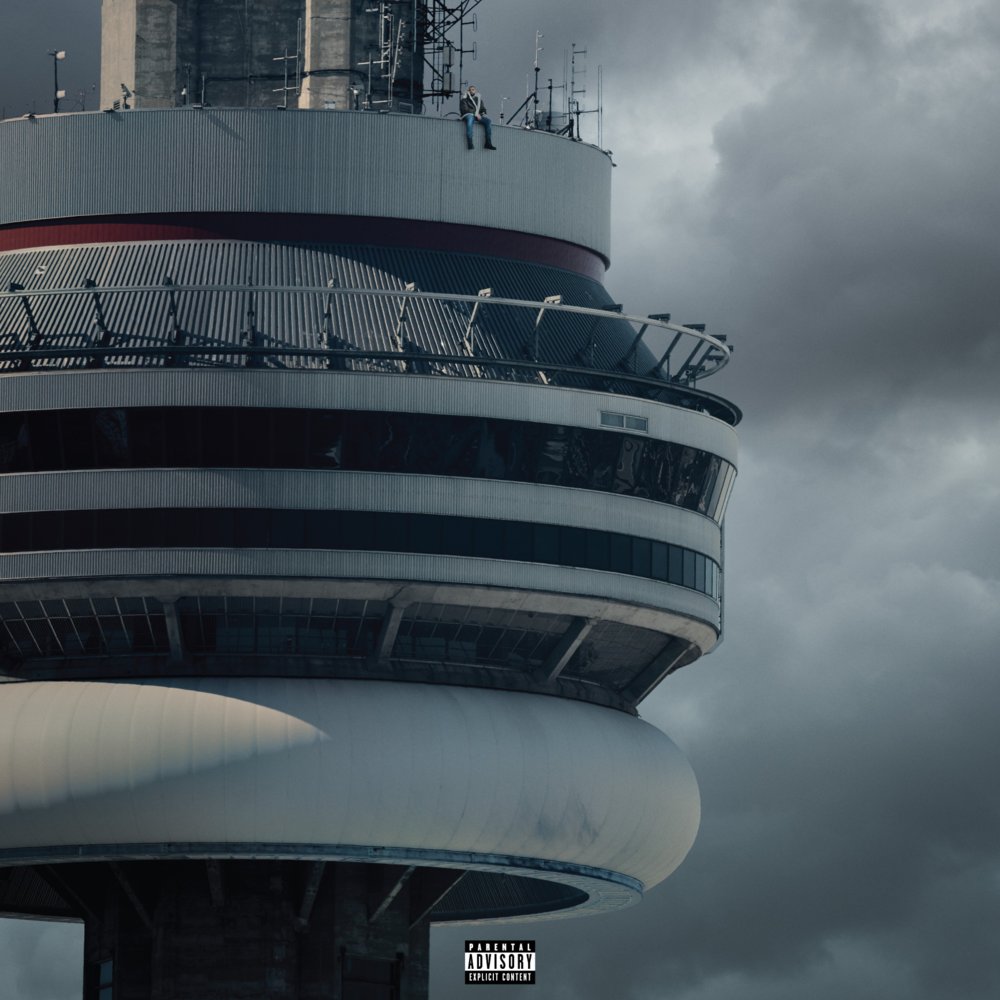
I noticed that although they are all in the same music genre, Drake's in particular stands out to me. It is a completely different style to all the others. The image simply consists of the top of a tower, with no album or artist title. Although Drake is one the cover (if you squint your eyes and look really hard), he is not being constructed as this image that is sold to an audience. Drake is one of the biggest artists in the current world, with his album 'Views' reaching number 1, along with multiple singles. Drake's star image is so big, he can be organic, and his appearance doesn't need to sell to an audience. The audience know that this album is Drake's, which is why there is no title on the front cover. Likewise, we do not need to see his appearance, as his music is the selling point.
The technical conventions, interestingly are the same. It is also a mid shot, showing only an aspect of the tower. With a simple background and framing, the tower fills the cover. However, the colour scheme is different to the Ladies covers. Drake's is more grey and monotone, whilst the ladies are more colourful and catch the viewer's eye. Drake's music leans more towards the rap end of the R&B spectrum, and he is a male. He will therefore not be constructed with a colourful more 'pop-like feminine' end to the R&B spectrum.
Furthermore, Drake's symbolic conventions of the clean grey theme continues to the rest of the digipak. The subtle grey cloudy pattern is sported on the back, along with simple and clean white font crediting the makers of the album and the song titles.


Overall, the conventions of R&B music differ and depend on the Star Image of the artist. They usually present the symbolic conventions of a photoshoot of the artist, but a clean and simple composition. They tend to use fairly simple colours, as the buyer focuses on their appearance and doesn't want to be overwhelmed. If the artist is more well known, such as Drake during his album release, the image is more organic. Drake doesn't sell upon his star image, but his music instead. The solo female artists, such as Beyonce and Carey, do sell on their star image at that point of it's release. This explains their concept behind using a photoshoot for their album covers.
Tags:
a2


0 comments