Photoshop: Final evaluation of product


I looked at different designs that influenced mine. These in particular are all distortion of the face, telling the audience that its more about the music than the star image. Furthermore, my original image showed already a distorted face so my original image was an influence in itself.


Throughout the process of creating this design, my idea didn't develop significantly, particularly as I had roughly sketched the idea on paper beforehand. However my idea from creating a colourful artwork developed to a cleaner black and white version, which I think was more effective and suited towards the audience that the album is targeting.


I drew a quick sketch on paper of what I was roughly trying to achieve. This was useful to visualise the final product and save a lot of time trying to figure out what i want through photoshop. I will definitely do this technique in the future as you can map out what your design and then simply recreate it in photoshop, rather than experimenting with tools when you don't fully know what you're looking for.
I also drafted a design using the combination of both my original image and another one. I was experimenting to see whether I could merge the two together along with the sections however it just ended up looking messy.
I explored different options for the design such as:


Throughout the process of creating this design, my idea didn't develop significantly, particularly as I had roughly sketched the idea on paper beforehand. However my idea from creating a colourful artwork developed to a cleaner black and white version, which I think was more effective and suited towards the audience that the album is targeting.
- What genre did you create? Do you think this is clear (use conventions)
- Is this for a band/artist? Is this clear to your audience?
I think I created an artwork that fits into the alternative indie genre. The title Elise Myrtle clearly shows that this act is a single artist, supported by the single figure on the artwork. The conventions of this artwork show that this is not of a classic or acoustic genre. There are no instruments or any elements in the album to represent any type of traditional style of music. I think it's clear to the audience that this genre is modern and may use electronics within it. However, it still may look slightly like it could be in the pop genre, as typically pop artwork neither show any traditional elements such as instruments. This trend can be seen through other examples of pop artwork, such as:

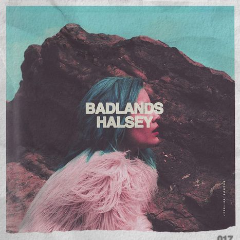


The target audience for this artist is the younger generation, particularly girls between ages 15-25. Boys may also be targeted to the young female solo artist. This target audience is looking for modern and updated music, particularly in this era they are particularly attracted to remixes and electronic music. My album artwork reflects the modern conventions of the electronic music genre.
Relating to Negus's theory I feel that I've created a combination of synthetic and organic. The album shows the star artist on the cover, however, it is distorted by different sections of the image. The image of her face hidden shows that the selling point is more about the music, than the star image. This therefore makes this album more organic. On the other hand, the cover is still displaying conventions of a alternative pop indie genre, whilst her face still featuring on the cover without any instruments etc. This could also mean that the audience could see this artist as synthetic.
Overall I believe this workshop to be extremely useful in designing Digi Packs. It has helped me to not only develop my photoshop skills, but also open my mind to a variety of different designs and how they can connote different ideologies about the act. I believe my design was successful in showing those ideologies, whilst keeping an aesthetically clear and clean image thats easy for audiences to understand. I like my experimentation with the title and the fragments to create a simple but meticulous design.

However, with a bit more time, I may have begun to play around with different adjustments, paying closer attention to hues and opacity. I would also sort out the composition by trying to place the artist in the dead centre of the cover and not towards the right.
I particularly liked this version of the cover, which was created through an accident. I like how the artist name is repeated as it looks like a genuine glitch (which it was) I also like how there is almost an echo of the artist's head behind it, bringing more complexity into the cover.

Tags:
a2


0 comments