Ella's Media Studies Blog

  • Home
  • Blog Archive
  • Evaluations
  • A2 Posts
  • A1 Posts
Ben Howard is an up and coming artist, who's focus is mainly on the music rather than the star image. He is a synthetic act, and his album and homepage designs reflect this anonymity behind the music.


The Digipak for Howard's latest album 'I Forgot Where We Were'. The cover features only himself on it, the first album cover of his to have that. Yet, there we can only really see have his face. This album cover reflects his star image. He is not quite a star, but up and coming. His focus is still on the music but has increasing popularity with his target audience. If I were to see this CD cover in the shop I would think of it to be of an indie alternative genre. Furthermore, the title and artist name is hidden in the corner of the cover. This subtlety tells the audience that he is a synthetic act, as he is not making an obvious effort to brand himself and his music.


    The design is simplistic and neutral. I like how he doesn't need any massive labelling or design to sell his music. His unique selling point is that his style is so simple and relaxing. This design matches his style of music. 


These are designs from older albums, instead of featuring himself feature drawings and photographs. The theme around these designs are old vintage looking. They also relate to the album title (Black flies, Old Pine etc.)

With my design, I would want a simplistic design, that connotes the passion for the music instead of the star image. I particularly like the drawings and the neutral tones of the images. The greys and blacks give a soft and relaxing mood. These images are clearly from an indie synthetic act.

My favourite album design by Ben Howard is for the Burgh Island. It's composition fills the cover with parallel lines, the design is so filling yet so simple and clean cut. The breaking of the lines to show the Burgh Island is all the album needs to relate to the title, and show the audience that this is a chilled low key acoustic style of music.


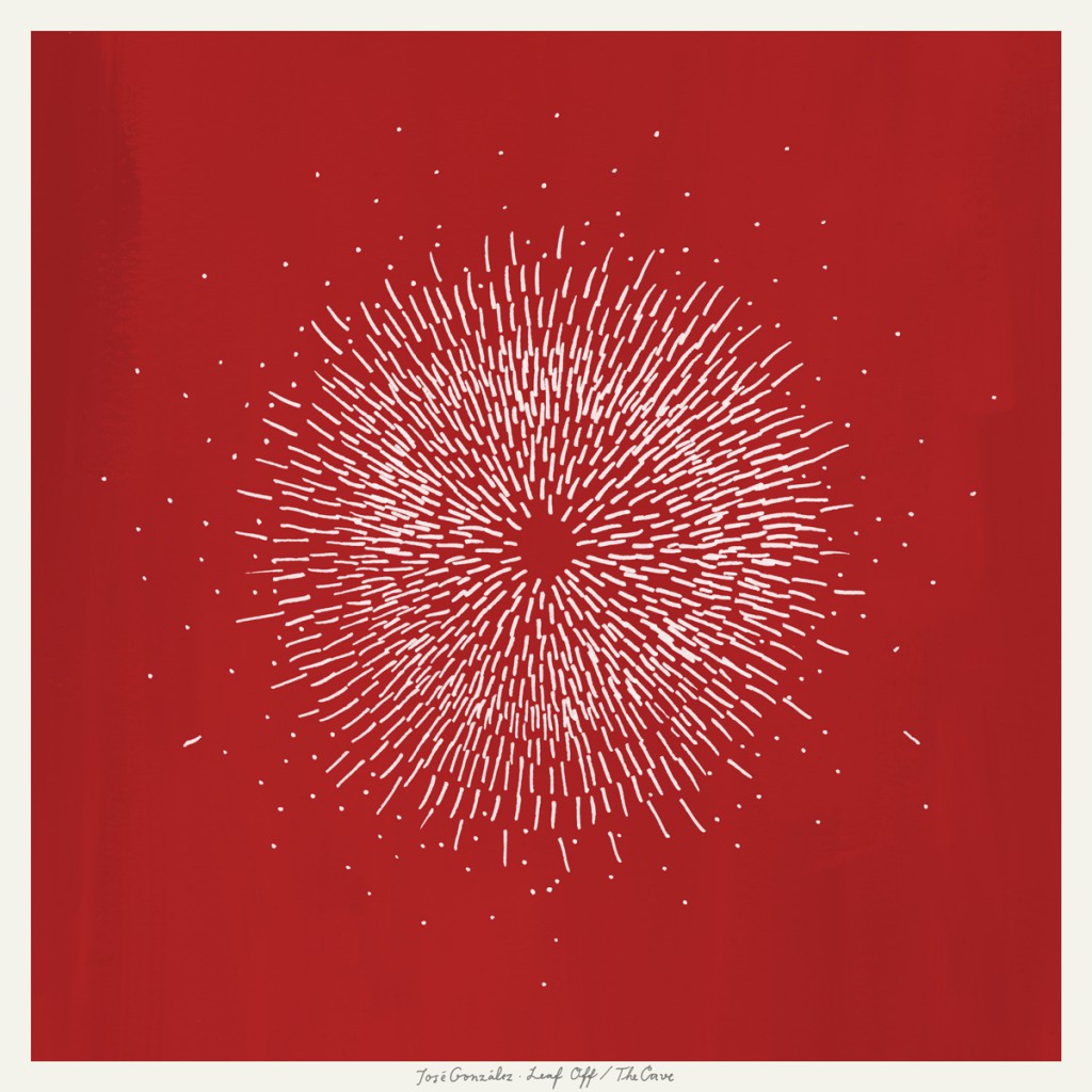
I also looked at some similar artists such as José González and Damien Rice, who are also acoustic indie male singers. 


González captures a similar style to Howard's covers. They are simple album art, subtly drawn but somehow fills the page. The album title and artist name tucked away. However, these album designs are more colourful and engaging that Howard's, matching his more upbeat style of music than Howard's. Likewise, González has a smaller audience than Howard's, therefore his star image is not as developed. This may be one of the reasons why you don't see anything featuring the singer, but instead drawings that his music reflects.

I particularly love these designs and how simple they are. In terms of album covers I believe Less is more when displaying something of the indie genre. The design must be simple and soothing to match the simpleness and calming music it goes with.

Similarly, Damien Rice also takes on the clean cut drawing designs for his album 'My Favourite Faded Fantasy'. This design feels more personal than the others, especially  with the album title including 'My'. The feelings I receive from this cover is that we're looking at something thats very close to Rice. There is a hint of sadness in this cover. The vintage colourless look of the cover is a contrast to those of González's. In terms of my cover, I think that Conrad is a combination of colourful and colourless. I like the idea of my digipak containing faded washed out colours, if even that. 

I then began looking at websites. Howard's website is similarly a clean and simple design. There is no obvious information or any advertising to buy his album or sell tickets. The design is very raw and real. You simply see his logo in the corner, along with his latest album cover filling the webpage. However, you are automatically redirected to his autoplayed music video for his single 'I Forgot Where We Were', which has been scaled up to fill the page. Personally I don't like this feature as it takes away the simpleness of the page, and you can't pause/stop the video. The video is also bad quality as it's been stretched to fit the page. 

The colour scheme matches the album covers and the concept of the information being in the corners out of sight to make a clean look is something that I would like to replicate. I think with this style of music, there is no reason to overwhelm the viewer with lots of information. Instead it introduces the viewer to a simple and subtle design.
Similarly with other artist's pages, they also match the album covers. However, they all have different layouts. Rice's for example, has the webpage designed like a blog page. The information is received by scrolling down the page looking at posts with a timestamp. I personally don't like this design because it is cluttered and information can be very easily missed.
 José González's webpage is similar in format. It has a scroll to see more information about the artist. The design is cleaner than Rice's, and the colour scheme matches the latest album cover.

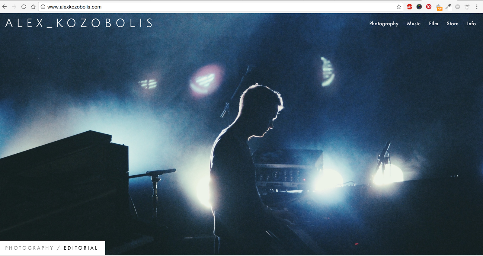
I then stumbled across this pianist/photographer's website Alex Kozobolis. Although this is a combined website showing his different platforms of work, I really liked the design of this page.  The logo is neatly in the corner, the stunning photos shuffle randomly. The page simply showcases the work of the artist and doesn't push information in the viewer's face. This is similar to Howard's design. 


For my webpage, I think I will have a clean and neat theme, which matches the album cover and colour schemes. I think this clean theme matches the star image and style of Howard. It is about the music, rather than getting sales. 
For this idea, the genre of music is alternative remix, but overall falls in the pop category. The original singer Banks, is an alternative indie singer. However, the remixers Snakehips are producers of Pop music.

The two artist's websites are completely different. On Bank's webpage, you are simply introduced to this picture. There are no words or information present. There are two hover links: one on each person. This lack of logo/text is very alternative and I personally found this extremely surprising. There is a glow around Bank's where I have hovered my cursor over her. C

Clicking on Banks, you are taken to her latest music video for her single 'F*ck with myself', which autoplays and fills the screen. Likewise, there is still no text or information about the singer or where to buy her album. 


Clicking on the mannequin on the left, you are taken to this page. This gives you the opportunity to face swap with the mannequin. I believe this to be a promotional opportunity, as well as just being plain amusing. 


Furthermore, on the homepage, scrolling down you are given the opportunity to get her latest single. Banks' star image is clearly different from others. She even makes it difficult to find the information that on other websites, including Snakehips, is obvious and the first thing you would see. 


On the other hand, Snakehips introduces you immediately to their latest single Cruel ft. Zayn. Their logo is in the dead center of the album cover, with share buttons at the top to spread the sale. Their design is also minimal. It requires you again to scroll down to find the information. You find the music video and the concert dates. Along with the opportunity to buy their music. 

Snakehips is a complete contrast, who's star image is constructed and revolves around getting sales from audiences. 


I think with my homepage, I must combine the two contrasting websites together. This remix is pop and upbeat, yet it still contains the Avant Garde theme of Bank's music. 

Furthermore, I looked at other artists websites which fall in the alternative pop category.
I looked at Mikky Ekko's homepage, which also sports a very minimal and lack of text design. However, the logo of the artist is neatly at the top. The information is displayed in logos and videos. You can find his music on spotify using the sharing logos and find him on social media. His latest videos are displayed first thing to the viewer. For my webpage, I would have more information, perhaps multiple pages with different features. On the other hand, I would keep the clean minimal style of Banks and use photography as an essential base of the website like Banks'. 

Furthermore, the digipaks match Banks' homepage. The album covers are all in Black and White, and continues the theme of a minimal and clean design. The first design you can only see the bottom third of Bank's face. Her star image is clearly a mysterious and alternative figure, breaking away from the typical conventions of a female solo pop singer. She has a distinct logo which is used on all her designs. I like the idea of using a simple zoomed in photograph as the overall design of the cover. 


This is the design for Snakehips' remix. It likewise continues on the style of Banks minimal conventions. In fact, the photograph of the water is the same, there is just a different but equally as effective logo. The font is simple and clean. Overall I really like these designs to be clean and not showing any constructive star imagery, as that is not what the track is about. 

For my design, I would continue the minimal theme and focus on the presentation of the music and what genre it conveys, rather than the star image of the artists. 

A similar style to this is Gryffin's remix of Tove Lo's Talking Body. This also captures a minimal design where the star image is not constructed. This remix combines both elements of pop and alternative, which is shown in the cover.


For my final idea, I looked for a more upbeat song that would feature a band. I finally chose a song called Gold Snafu by Sticky Fingers. Sticky Fingers is an Australian reggae indie pop band. The reggae pop style of their music was influenced by bands such as Pink Floyd and Arctic Monkeys. To me, their songs reminds me of hippy decades music.


The original music video also has a retro theme. It is completely narrative based (the song doesn't start until 3:00).


My idea however, is performance based. I wanted to continue the ridiculous and fun element of the track. Sticky Fingers have five members: Lead singer, Bass, Guitar, Keys and Drums. So my video would feature a band of four or five. They will be featured against a plain background of either white or a solid colour. There will be close ups and long shots of the band playing together
The video will contain retro but ridiculous elements such as soap suds, an indoor swing, a disco ball and a ball pit. The whole concept will have a retro decades atmosphere, with background dancers, ridiculous dancing and jumping around.


The visual style of the piece would be retro looking, with decade themed costumes exploding with colour. Everything will be quite over the top, similar to Galantis' music video for Peanut Butter Jelly.


I was also influenced by Capital Cities' music video 'I sold my bed but not my stereo', which also portrays a retro theme. The costumes in this music video is what I imagine the band to be wearing.


The aesthetic design of the shots are almost cartoon like, with a vintage yellow hue and retro props. 
I also took inspiration from Katy Perry's Last Friday Night, which contains a lot of vibrant colours and party scenes. I particularly like the retro colour blocked outfit that Katy is wearing in the video. 


I think this idea fits with the star image of Sticky Fingers. They are of a more reggae pop genre, where their videos are silly and their music is fun. Unlike my previous two ideas, the star image of this band may lean more towards the synthetic side. It is more about the joy and fun that the music gives, than the beauty or meaning behind it. This means that the video is likewise fun and silly, matching the conventions of the band.
Sticky Fingers


For my second idea I wanted it to be a completely different style of music to the first. I decided to choose Conrad by Ben Howard. Ben Howard is an English indie solo artist who produces music in the folk and acoustic genres. He uses percussive instruments and guitar for his songs. He is most famous for his single Old Pine from the album Every Kingdom.


This particular track 'Conrad' is from his latest album I forgot where we were. It is number 9 on the album and is based on the short novella entitled The Tale by Joseph Conrad, published in 1919. 

I've been listening to this song for many years now. Every time I listen to this song, it brings me visions of night time and the New York night skyline. The song is comforting and soft, with a gentle beat. It reminds me of dreaming and the silence in the chaos - as if you were to look at the New York Nightlife from a distance. 


(I really love New York)

However as we can't fly out to New York (as cool as that would be) We could have the same effect in the nearest city London against the river or on top of a hill e.g. Southwark, Primrose Hill etc.

The concept of this video is narrative and performance based.
The narrative is that a group of 2 or 3 friends are seen camping together in the woods by a lake or on the viewpoint looking out to the surrey hills. They are sitting by a bonfire eating smore's and marshmallows etc. They are dressed in autumn/winter clothing with big padded jackets and wooly hats. The friends are dressed to appear young, around teens. The audience then starts to see shots of the 3 friends separately, looking much older, walking around the streets of London at night. They are dressed in smart wear as if they had just come from office jobs. They seem lost and confused about what to do. At the end of the video we see the three of them reunite on the river bank, and look at each other as if they haven't seen each other since the camping trip years ago.

The camping idea was inspired by Seafret's Give Me Something:


These images perfectly capture what I see in my head with the campers. 


Futhermore, the performance element of the video will be a young male solo artist singing in the studio. He is lit by a single light behind him, casting shadows. The background is dark, he is sitting on a stool playing a guitar and singing into a microphone. The singer will wear something casual such as a plaid shirt and a fedora.


I also like the idea of shooting the singer in Black and White, along with walking around London during the day instead of night. I think the effect will work better at night, however, in terms of contrasting the two narrative shots even further, there could be an experimentation with light and dark. 

This video includes a lot of cinematography and smooth editing techniques. For example, I liked the idea of panning the camera from the singers face to the light. Which could then transition via a graphic match with the stars at the campfire, before panning down to the bonfire. I also liked the idea of using a time lapse in some places, which I believe suits the track - as it suits the idea of the silence in the chaos. For example, at the end of the track (5:11) there is a change of beat, where I think would be really effective to reverse all the previous clips at super speed before showing the reuniting of the friends. 

This idea matches the star image of Ben Howard, as he is an organic act. He focuses more on his music and the feelings they connote rather than himself. Although one element of the video will be a singer, that will not be the main focus. One issue with this track is that it's very long, however, this can be fixed with some editing and cutting down. 

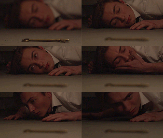
walking around at night


Newer Posts Older Posts Home

CROESO

Ella's Hurtwood House Media Blog

POPULAR POSTS

  • Music Video Analysis: Madonna's Like a Prayer
                                Madonna's hit single "Like a prayer" was released in 1989, a time of racial and religious order a...
  • Camera Angles/Shots/Movements
    Establishing Shot:   Usually the first shot of a scene. Lets audience know where action is taking place. Usually a very/extreme wide shot. ...
  • Studio Lesson 2
    STUDIO LESSON We began with learning about the 180 degree rule. We saw a demonstration of a motorbike traveling across a road to visua...
  • The Imitation Game
      The Imitation Game directed by Morton Tyldum, tells the story of a newly created British Intelligence Agency  (MI6) , which recruit...
  • Studio Camera Lesson
    Last week we learnt about the different cameras used in media, and how they function to get the best possible setting. We first explored the...
  • Looking at Websites: Ariana Grande
    I began looking at websites as a component of music campaigns. I compared the websites of Ariana Grande and Rihanna, both very popular arti...
  • Types of Thriller Sub-genres
    Thriller is a genre that uses excitement, suspense and tension as its key elements. Aviation : A thriller that is set on an air flight, ...
  • Research: What is a shot list?
    A  shot list  is a document that  lists  and describes the  shots  to be filmed during principal photography. Shot List for Memento (...
  • Preliminary Task - Studio Lesson 4
    In this weeks studio lesson, as part of coursework we created a short film sequence in a group of four. The preliminary task required us t...
  • Use of sound in thriller/horror films
      The Woman in Black (directed by James Watkin in 2012) would typically be classed as a horror film or a paranormal thriller. Likewise, ...

Featured Post

AS Thriller

This is our final media product titled 'The Salvatore'

Blog Archive

  • ▼  2017 (10)
    • ▼  February (2)
      • My Final Products
      • Evaluation Question One: In what ways does your me...
    • ►  January (8)
  • ►  2016 (166)
    • ►  December (14)
    • ►  November (13)
    • ►  October (56)
    • ►  September (24)
    • ►  August (2)
    • ►  June (7)
    • ►  March (16)
    • ►  February (13)
    • ►  January (21)
  • ►  2015 (24)
    • ►  December (7)
    • ►  November (4)
    • ►  October (7)
    • ►  September (6)

Search This Blog

Pages

  • Home
  • BLOG ARCHIVE
  • EVALUATION

About Me

Popular Posts

  • Music Video Analysis: Madonna's Like a Prayer
                                Madonna's hit single "Like a prayer" was released in 1989, a time of racial and religious order a...
  • Camera Angles/Shots/Movements
    Establishing Shot:   Usually the first shot of a scene. Lets audience know where action is taking place. Usually a very/extreme wide shot. ...
  • Studio Lesson 2
    STUDIO LESSON We began with learning about the 180 degree rule. We saw a demonstration of a motorbike traveling across a road to visua...
  • The Imitation Game
      The Imitation Game directed by Morton Tyldum, tells the story of a newly created British Intelligence Agency  (MI6) , which recruit...
  • Studio Camera Lesson
    Last week we learnt about the different cameras used in media, and how they function to get the best possible setting. We first explored the...
  • Looking at Websites: Ariana Grande
    I began looking at websites as a component of music campaigns. I compared the websites of Ariana Grande and Rihanna, both very popular arti...
  • Types of Thriller Sub-genres
    Thriller is a genre that uses excitement, suspense and tension as its key elements. Aviation : A thriller that is set on an air flight, ...
  • Research: What is a shot list?
    A  shot list  is a document that  lists  and describes the  shots  to be filmed during principal photography. Shot List for Memento (...
  • Preliminary Task - Studio Lesson 4
    In this weeks studio lesson, as part of coursework we created a short film sequence in a group of four. The preliminary task required us t...
  • Use of sound in thriller/horror films
      The Woman in Black (directed by James Watkin in 2012) would typically be classed as a horror film or a paranormal thriller. Likewise, ...

Advertisement

Copyright © 2016 Ella's Media Studies Blog. Created by OddThemes