Ella's Media Studies Blog

  • Home
  • Blog Archive
  • Evaluations
  • A2 Posts
  • A1 Posts

After scouting for different songs I could use I remembered a song called Warm Water By Banks, however I preferred the Snakehips Remix to the original. Banks is an American singer producing songs in the alternative R&B, pop, and 'trip hop' genres. She is most famously known for her single 'Beggin for Thread'. Furthermore, Snakehips is a British band whom started out doing remixes for Banks, The Weeknd and more. Their most recent single Cruel featuring Zayn peaked at number 33 in the UK charts.


This particular remix is both upbeat and relaxing. It's not your typical dubstep, EDM music that most people tend to associate the word remix with. It stays true to the style of the song and the genre it falls into. When I listen to this song, images of flashing lights, paparazzi, fashion runways come to mind, almost similar to Madonna's Vogue. I get a theme of Avant Garde with modern lighting effects and editing techniques.
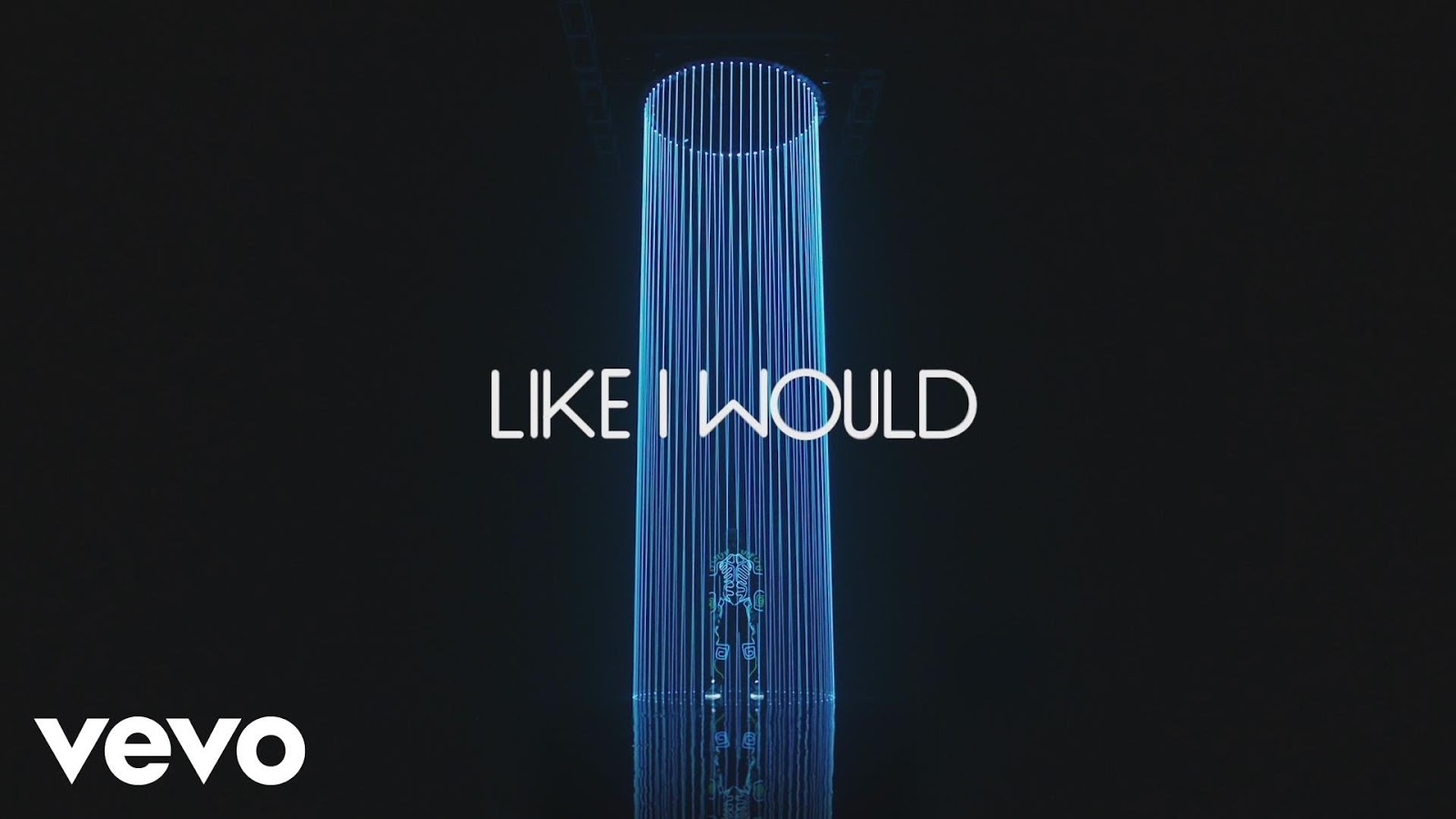

My idea for a video is performance based. The video would feature a solo female artist representing Banks. My main concept is for the artist to be singing in a pitch black room while being lit by different kinds of lighting methods. The video would feature close ups and long shots of the artist singing. My intentions for using these lighting features are to create aesthetically pleasing and mysterious shots where the modern style matches the modern remix of the track.
Extreme long shot: The simplistic lighting effect of colourful led lights against a black background.

Close up: This lighting effect was created by having a slit of light created by a flashlight cast upon the face. The effect was then duplicated on photoshop. 

An extreme long shot: This was created by a flashlight and duplicated on photoshop. This effect could be replicated simply by using a disco ball or a reflective object.


Referring to the runway and catwalk images, having the artist on a turning table while singing for some shots would be effective and good for editing purposes. The artist could be on the turntable with spotlights on them against a black background, which could then be effective using jumpcuts. The video could also feature background dancers posing in 'Vogue' positions to add an extra element.  
A turning table which the artist would stand on
  Similarly I like the idea light panning across the face. I recently saw an experiment where it looks at angles of lighting have an effect on the face. I thought this effect would look really dramatic and mysterious in the music video.


I would also like to experiment with different colours and silhouettes. This is becoming a popular trend in music videos to have silhouettes and bright LED colours together or on their own. In particular it is frequently used in the 1975's music video for their single 'Ugh!' which I took inspiration from:


Furthermore, this msuic video also uses multiple jumpcuts and lighting effects which look really effective against the black background.
The video cuts from shots with silhouettes to fully lit shots. The bright colour scheme matches the modern style that I intend. There are bold lighting effects which are emphasised against the black background and show the silhouettes of the artists infront of it.


The video will open with a DJ during the murmuring of the crowd, as if the number is about to start and people are warming up. He will have a turntable and headphones.
                                                                                                           ,                                                                       To add different sets and elements, the colour schemes, silhouettes and bold lighting effects will be a substitute for set changes. More elements include the DJ and the backup dancers.

a close up: the colour scheme of the neon lights lighting his face

the silhouettes within the black background. 

I also considered having another element of the singer walking around a town at night. She is walking to a party or a bar. This would be the narrative element to the video and will change up the shots so that the video doesn't get repetitive and meaningless.

As I had previously mentioned I want this to revolve around an Avant Garde theme where the effects of this video are experimental and bold. These match the style of the modern track, as being quite an alternative piece to what you would normally hear. Similarly, this also matches the star image of Banks herself. As viewers see her as an alternative and abstract woman. She is not constructed as a typical pop star would be and presents herself to be a more mysterious figure than a pop idol
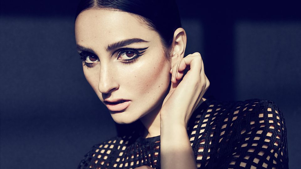

Banks


 From this workshop I have learnt to explore different ideas and primarily sketch beforehand. Through this I have realised that experimenting and creating different designs can connote different ideologies. For example, from creating the polygonal sections in front of the face, the image looked like it had 'glitched' up, so I decided to name it Glitch. The style of artwork matches the alternative indie genre. Another example of these ideologies is a completely different album art cover of Carly Rae Jepsen's album 'Kiss'. Unlike my cover, this album is fitted to a more pop genre, and is more suited towards Dyer's star theory.


I looked at different designs that influenced mine. These in particular are all distortion of the face, telling the audience that its more about the music than the star image. Furthermore, my original image showed already a distorted face so my original image was an influence in itself. 

I drew a quick sketch on paper of what I was roughly trying to achieve. This was useful to visualise the final product and save a lot of time trying to figure out what i want through photoshop. I will definitely do this technique in the future as you can map out what your design and then simply recreate it in photoshop, rather than experimenting with tools when you don't fully know what you're looking for. 

I also drafted a design using the combination of both my original image and another one.  I was experimenting to see whether I could merge the two together along with the sections however it just ended up looking messy. 
I explored different options for the design such as:


Throughout the process of creating this design, my idea didn't develop significantly, particularly as I had roughly sketched the idea on paper beforehand. However my idea from creating a colourful artwork developed to a cleaner black and white version, which I think was more effective and suited towards the audience that the album is targeting.

  • What genre did you create? Do you think this is clear (use conventions)
  • Is this for a band/artist? Is this clear to your audience?
I think I created an artwork that fits into the alternative indie genre. The title Elise Myrtle clearly shows that this act is a single artist, supported by the single figure on the artwork. The conventions of this artwork show that this is not of a classic or acoustic genre. There are no instruments or any elements in the album to represent any type of traditional style of music. I think it's clear to the audience that this genre is modern and may use electronics within it. However, it still may look slightly like it could be in the pop genre, as typically pop artwork neither show any traditional elements such as instruments. This trend can be seen through other examples of pop artwork, such as:


The target audience for this artist is the younger generation, particularly girls between ages 15-25. Boys may also be targeted to the young female solo artist. This target audience is looking for modern and updated music, particularly in this era they are particularly attracted to remixes and electronic music. My album artwork reflects the modern conventions of the electronic music genre. 
Relating to Negus's theory I feel that I've created a combination of synthetic and organic. The album shows the star artist on the cover, however, it is distorted by different sections of the image. The image of her face hidden shows that the selling point is more about the music, than the star image. This therefore makes this album more organic. On the other hand, the cover is still displaying conventions of a alternative pop indie genre, whilst her face still featuring on the cover without any instruments etc. This could also mean that the audience could see this artist as synthetic.

Overall I believe this workshop to be extremely useful in designing Digi Packs. It has helped me to not only develop my photoshop skills, but also open my mind to a variety of different designs and how they can connote different ideologies about the act. I believe my design was successful in showing those ideologies, whilst keeping an aesthetically clear and clean image thats easy for audiences to understand. I like my experimentation with the title and the fragments to create a simple but meticulous design. 
However, with a bit more time, I may have begun to play around with different adjustments, paying closer attention to hues and opacity. I would also sort out the composition by trying to place the artist in the dead centre of the cover and not towards the right.

 I particularly liked this version of the cover, which was created through an accident. I like how the artist name is repeated as it looks like a genuine glitch (which it was) I also like how there is almost an echo of the artist's head behind it, bringing more complexity into the cover. 


This is my final draft of my product


This design in accordance to Dyer's star theory, shows a less constructed image of a star, and leans towards the selling of music rather than image.  
The sections hiding her face are used to reach out to the target audience, showing them that this artist is more concerned with the music and the genre of alternative music than her star image. 

 I began this design with my own original image:

I then used the Polygonal Lasso Tool to select a section of the subject's face, creating geometric shapes. I then copy and paste it onto a new layer. I then began playing around with moving different sections. 

Select a section of the face with the Polygonal Lasso Tool 

To brighten up the sections and contrast them further to the original image, I used the curves tool on the specific new sections. 

I then attached the curves to that specific layer so that it only applies.

I then repeated this method with multiple sections and stacked them on top of each other. Along with increasing brightness/contrast and decreasing the saturation on some big sections.


Then I began to add some different colouring and adjustments to the image. I began editing the base (original) image by decreasing the vibrance and brightness. 
The base layer is less saturated and darker. 

The adjustment layers for the base image
 I then added curves to brighten the image and changed it to B/W. I chose to do this between the sections of layers I made, so that it only affects half the stack of layers.  I changed the image to B&W as the different shades and hues of purple clashed with the shades of skin and looked ugly. The whole image looked incredibly messy so applying B&W onto the image will blend all the layers together.
The curves and black and white adjustments between the layers affect half of the image while leaving the rest.
I then changed the remaining half of the image to B/W. And began adding the text. I used a random name generator online to come up with the artist. I used the 'Monsterrat Ultra Light' font. 


I then added the album title which I named 'Glitch'. This suited the album artwork and style of design, while fitting with the 'alternative' genre of music.


However I wasn't satisfied with the basic title, so I therefore used the rectangular marquee tool to slice the title in half. I kept the bottom half in tact whilst the top half I decreased the opacity and shifted the section slightly over to the right. This suited the style of artwork much better and now doesn't seem like it's randomly placed on top.


Newer Posts Older Posts Home

CROESO

Ella's Hurtwood House Media Blog

POPULAR POSTS

  • Music Video Analysis: Madonna's Like a Prayer
                                Madonna's hit single "Like a prayer" was released in 1989, a time of racial and religious order a...
  • Camera Angles/Shots/Movements
    Establishing Shot:   Usually the first shot of a scene. Lets audience know where action is taking place. Usually a very/extreme wide shot. ...
  • Studio Lesson 2
    STUDIO LESSON We began with learning about the 180 degree rule. We saw a demonstration of a motorbike traveling across a road to visua...
  • The Imitation Game
      The Imitation Game directed by Morton Tyldum, tells the story of a newly created British Intelligence Agency  (MI6) , which recruit...
  • Studio Camera Lesson
    Last week we learnt about the different cameras used in media, and how they function to get the best possible setting. We first explored the...
  • Looking at Websites: Ariana Grande
    I began looking at websites as a component of music campaigns. I compared the websites of Ariana Grande and Rihanna, both very popular arti...
  • Types of Thriller Sub-genres
    Thriller is a genre that uses excitement, suspense and tension as its key elements. Aviation : A thriller that is set on an air flight, ...
  • Research: What is a shot list?
    A  shot list  is a document that  lists  and describes the  shots  to be filmed during principal photography. Shot List for Memento (...
  • Preliminary Task - Studio Lesson 4
    In this weeks studio lesson, as part of coursework we created a short film sequence in a group of four. The preliminary task required us t...
  • Use of sound in thriller/horror films
      The Woman in Black (directed by James Watkin in 2012) would typically be classed as a horror film or a paranormal thriller. Likewise, ...

Featured Post

AS Thriller

This is our final media product titled 'The Salvatore'

Blog Archive

  • ▼  2017 (10)
    • ▼  February (2)
      • My Final Products
      • Evaluation Question One: In what ways does your me...
    • ►  January (8)
  • ►  2016 (166)
    • ►  December (14)
    • ►  November (13)
    • ►  October (56)
    • ►  September (24)
    • ►  August (2)
    • ►  June (7)
    • ►  March (16)
    • ►  February (13)
    • ►  January (21)
  • ►  2015 (24)
    • ►  December (7)
    • ►  November (4)
    • ►  October (7)
    • ►  September (6)

Search This Blog

Pages

  • Home
  • BLOG ARCHIVE
  • EVALUATION

About Me

Popular Posts

  • Music Video Analysis: Madonna's Like a Prayer
                                Madonna's hit single "Like a prayer" was released in 1989, a time of racial and religious order a...
  • Camera Angles/Shots/Movements
    Establishing Shot:   Usually the first shot of a scene. Lets audience know where action is taking place. Usually a very/extreme wide shot. ...
  • Studio Lesson 2
    STUDIO LESSON We began with learning about the 180 degree rule. We saw a demonstration of a motorbike traveling across a road to visua...
  • The Imitation Game
      The Imitation Game directed by Morton Tyldum, tells the story of a newly created British Intelligence Agency  (MI6) , which recruit...
  • Studio Camera Lesson
    Last week we learnt about the different cameras used in media, and how they function to get the best possible setting. We first explored the...
  • Looking at Websites: Ariana Grande
    I began looking at websites as a component of music campaigns. I compared the websites of Ariana Grande and Rihanna, both very popular arti...
  • Types of Thriller Sub-genres
    Thriller is a genre that uses excitement, suspense and tension as its key elements. Aviation : A thriller that is set on an air flight, ...
  • Research: What is a shot list?
    A  shot list  is a document that  lists  and describes the  shots  to be filmed during principal photography. Shot List for Memento (...
  • Preliminary Task - Studio Lesson 4
    In this weeks studio lesson, as part of coursework we created a short film sequence in a group of four. The preliminary task required us t...
  • Use of sound in thriller/horror films
      The Woman in Black (directed by James Watkin in 2012) would typically be classed as a horror film or a paranormal thriller. Likewise, ...

Advertisement

Copyright © 2016 Ella's Media Studies Blog. Created by OddThemes