Ella's Media Studies Blog

  • Home
  • Blog Archive
  • Evaluations
  • A2 Posts
  • A1 Posts

The viewer is similarly first greeted with an introduction page, offering the viewer products to buy by displaying a countdown to her tour and showing them her new clearly successful fashion collaboration with Manolo, displaying the new fashion frenzy #THECREEPER.  Immediately the viewer is bombarded with products and shows the synthetic star image that Rihanna has obtained.

The website entails a greyscale experience with the information laid out in a photo collage. In comparison to Grande's website, Rihanna's star image is so popular, the website doesn’t just sell her music but shows fans what she’s been getting up to e.g. vacations, fashion collaborations, music awards etc. They don’t just want to sell her music, but they are constructing her whole celebrity image. The website allows fans access to all aspects of Rihanna's career, music, image, outings and more. 

Whilst Grande's website is targeted for teenagers and former Nickelodeon fans, following from her Sam and Cat career. Rihanna's target audience is more within the 20's age gap. Rihanna has more of a grunge look with more explicit lyrics and sexual ideologies. This target audience is more interested in fashion and the celebrity along with a more mature adult genre. The audience may perhaps be even more connected with Rihanna than with Grande, as the navigation bar shows Videos, Photos, Music, Fashion, Tour, Charity, Bio, Shop, Fragrance, Stance Stocks and more. 
The technical conventions show a numerous amount of information all laid out geometrically for audiences to use with ease. To not overwhelm the audience with information and add symbolic conventions of edginess, the greyscale involves a hover feature in which the information turns into colour. Rihanna's website however, is a bit more complex with the amount of information it has and the age suitability of its material. The photographs used to visually show her career are more risky and suitable for an older audience.
Unlike Grande's website, viewers can still see the evolution  of Rihanna's career by displaying all her albums and news since the beginning. The website still covers news about Rihanna's old albums, such as Unapologetic gaining 2x platinums, conveying the ideology that she takes pride in her music.
Overall, Rihanna's website almost reflects her life and successful career. It bombards the audience with what it seems organic information as it doesn't introduce them obviously to buying her products. However, subliminally, as Rihanna applies to Dyer's star theory, the audience is exposed to buying all kinds of different projects, such as fashion products and fragrances.

What's similar and different between the two artists:

  • Both artists use an introduction page, where they offer different digital music platforms and merchandise. 
  • The artists have different target audiences, shown through different styles. Grande's is easier to use than Rihanna's, as it is for a younger target audience. 
  • Rihanna still updates on her previous discography, unlike Grande who focuses on her latest album.


I began looking at websites as a component of music campaigns. I compared the websites of Ariana Grande and Rihanna, both very popular artists but of different styles and iconographies. 

http://www.arianagrande.com/home/


The viewer is first greeted with an introduction page, which allows you to immediately listen to the number one single on her new album Dangerous Woman on Spotify. And on the right, you are able to buy her merchandise immediately. 


On her official website home page, the first thing you see are Grande's music and concert videos from her latest album. The layout is clean, slick, and modern. And we see conventions of purity that are associated with Grande, from the black and white backgrounds.

The purpose of this website is to get the audience to listen to her music and buy merchandise. The website is very simple and clean, not overwhelming the user with information. This allows more sales as more users can access them easily from the website.


The website also has links to social media websites and an option to sign in/register. Users can sign up to the mailing list to find out the latest news and discuss Grande and her music in forums and social media. The register also allows fans to be entered into special competitions and more info, connecting Grande to her fans more personally.

Although Grande is a popular well-known idol among a younger audience, there is very little biography about her personal life or music career. The homepage simply introduces the audience to her image, music and merchandise. Grande is sold on her image and not her personality.

This website is targeted mainly for a younger audience of 12-25 years. Grande has already attracted a young audience from her Nickelodeon show Sam and Cat, so continues to sell towards that young audience as they are guaranteed sales. Her website is easy to use, simple, minimalistic, and modern. it is suitable for all abilities and ages, but mainly targeted towards females. It is evident from the style of merchandise shown on the homepage that the apparel is more feminine and not something a man would wear. The navigation bar of social media icons appeal to a more technological audience who will share Grande's work through the internet.


Grande's website includes symbolic conventions of a strong feminine artist but with a fun loving side. In the introduction web page which allows you to proceed to the official webpage or allows instant access to merchandise, there is also an option to click on the tea. The loading bar displays 'brewing...' which conveys an ideology of Grande being fun and bubbly. Furthermore, through comparison of her website now and her website a few years ago (above), you notice that her updated current website is much more sleek, minimal and monochromic. These symbolic conventions of the website's colour palette are used to match her new album "Dangerous Woman" and sends the overall ideology that Grande is trying to rid herself from her "Disney" image and grow up into a more mature and alluring woman. This ideology is particularly expressed through the mise-en-scene through the bunny costume and makeup in Grande's album covers and photographs. 


Websites are a key element for artists and bands. It is a platform to advertise, sell and promote the artist and their star image. The website can be used to construct and sell an artist's star image, by presenting them with what they are up to and providing more information - such as their biography/discography and when they are going on tour. Websites are an up to date advertising platform, where the marketing is ever changing. You do not see marketing for products that aren't the latest release on artist's websites. E.g. on Adele's website, her priority marketing would be her latest album 22.


Artists may used websites to gain a wider following. It is a channel or fans to find updates and communicate. Websites generally have email subscriptions and links to the artist's social media platforms, for fans to follow. Websites also allow accessibility for artists to promote and gain a global following. Their official status they perceive with a website exposes the artist to companies and labels, which can easily contact them to give them more opportunities. 


Websites are also a place to sell products of the artists. Not only can you buy their latest album both physically and digitally, but also there may be a shop set up, where you can buy artists merchandise. Concert tickets may also be sold on the website, where fans can book. This brings the artist more promotion and revenue, as they have made it as easy as possible for fans to find. 


Overall, websites are important for musicians, as they bring different element, such as selling, promoting, presenting information, communicating etc. all onto one platform; where fans and companies can easily navigate. 
I decided to create a website based on the existing band DNCE. As they are newcomers, they so far do not contain any merchandise or sales online. I chose DNCE as they are a colourful and stylish pop band.
http://lewisellen.wix.com/dnce


I was first given the choice of different templates, in which i chose a simplistic but modern and animating design. I believe the technical conventions of this websites should be very simple and fresh as they are just starting out. There is no need to clutter the website with unnecessary information. 


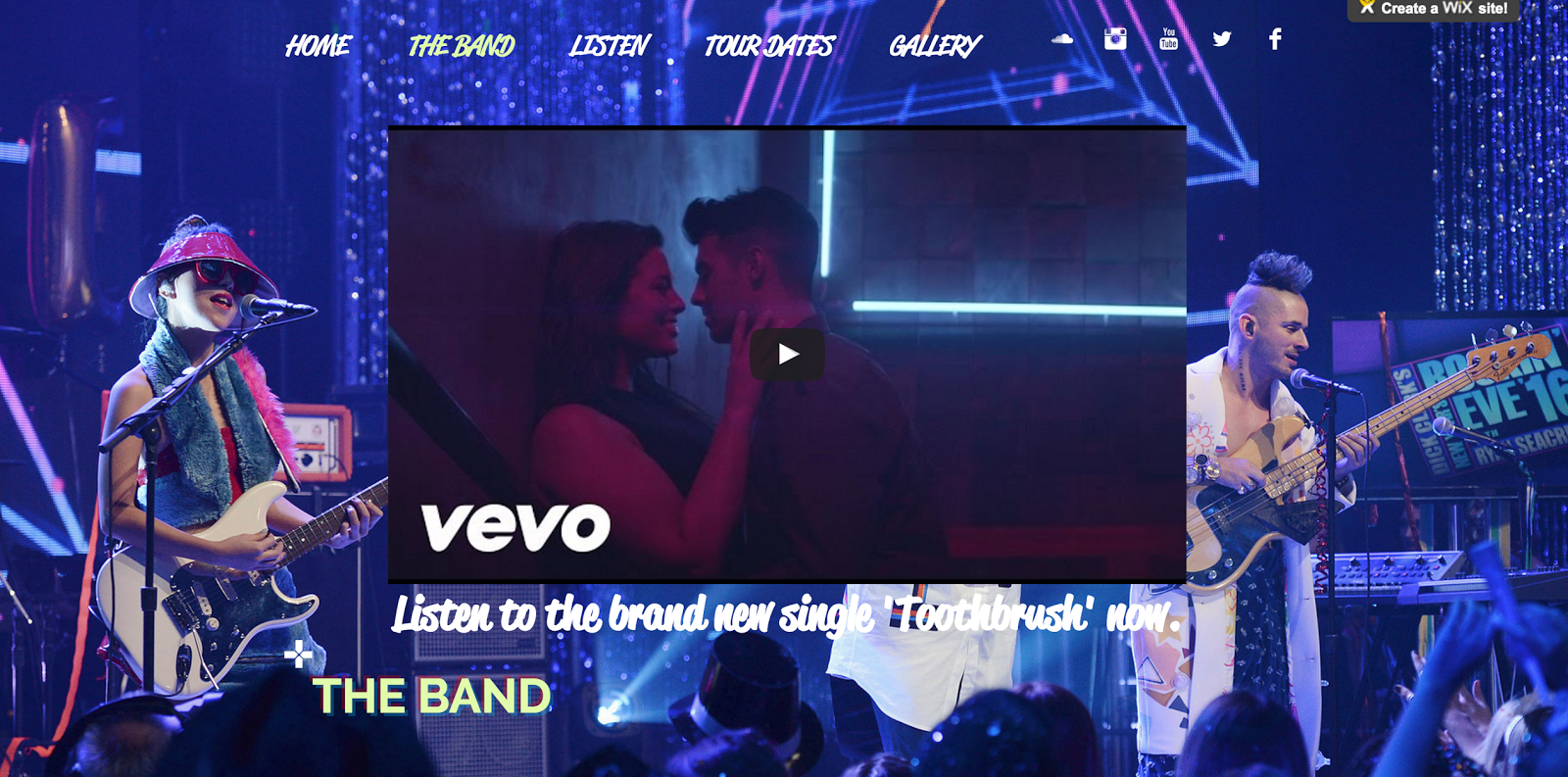
On the front page I wanted to introduce their signature photograph of them holding the balloons. It is a minimal and refreshing background with pops of colour, which hold technical conventions of cleanliness and refreshment in the music industry. As I experimented with text, I found the 3D feature to be quite appropriate for the technical conventions of the website. I used this 3D styling as a recurring feature throughout the website.  I also chose two recurring fonts: Reklame Script and Raleway. The Reklame was used for the title and the navigation bar and some pieces of information, whilst the Raleway was used for more official links such as buying tickets and listening to their songs. Again, I only used two fonts so the website was not cluttered and in a sense, the Reklame became their signature font. 


As the band are newcomers, it would make sense for their album to be uploaded to their website. They are not popular enough yet to have all their songs exclusively to buy before listening only. Their songs Pay My Rent and Jinx in particular, are free to listen on  Youtube. I converted the youtube files into mp3 and uploaded the songs onto the wix album player. I also linked videos and itunes to what they feature in such as Grease Live! 

I wanted to convey the symbolic conventions of modern cleanliness, but also flamboyant colour and a sense of fun. I particularly wanted to aim this website towards a younger target audience, through the bright colour palette used in the titles and the colourful backgrounds.

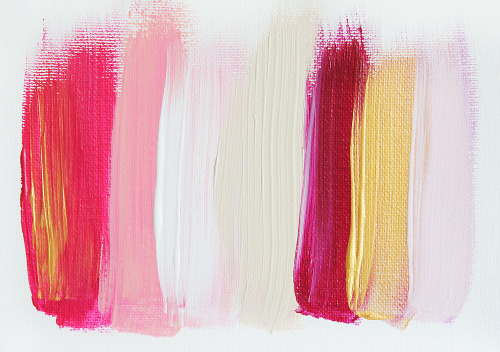
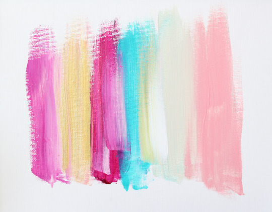
I used an online eyedropper tool to extract the hex codes out of these colours and applied them to the websites text. 

I also chose the parallax scroll feature where the you see the background once scrolling down from the information. This technical convention connotes a sense of modernism, as this feature is slick, fun and animating. It is rebelling against the traditional website in which I believe DNCE to be doing against the current music ideologies. 
I incorporated their new single 'Toothbrush', to target the audience into getting sales. DNCE is both organic and synthetic, with Joe Jonas putting the band together, but signing a deal with Republic Records to construct their star image. In which case, a synthetic website would normally immediately introduce the viewer to their products. 


I think I have applied Dyer's star theory in constructing them as an image for the audience. The target audience already know Joe Jonas from the hit band Jonas Brothers, and therefore he is the leading star that should be presented. I used images as backgrounds for the audience to see the band in action, and added links to Itunes and other streaming platforms available to hear. I also created a Gallery in which the viewers can see what the band has gotten up to. This all builds the star image and shows the popularity/likability of the band. Therefore, it sells the band's image and introduces their music to viewers. 
However, I have not applied Dyer's theory to the extent that the band have become a product. I still wanted to show the other 3 members and give some information about the band. As they are newcomers I chose not to create an entirely synthetic website as this would overload the new viewers to products that they have not yet certain on buying.

I wanted to attract a young audience with the colour and brightness of the website. The rebellion of both DNCE and the traditional website attracts more free spirited and music loving members as they are genuinely intrigued in the band and what they have to offer. I believe the technical conventions of the layouts, particularly with the funky shaping of the gallery and the colourful mise-en-scene portrays a sense of care-free and shows the audience that the band don't take themselves too seriously. 

I have also included an interactive page where you can buy tickets for their tour dates and a permanent footer which allows fans to sign up for newsletters and find out what DNCE are doing next.

In order to make the information accurate, I used wikipedia, Itunes, the official DNCE website, twitter, instagram, spotify, and more for the infromation.


After receiving feedback for our digipak draft, we decided that we need something different with the album. Our audience responded with suggesting that there is 'too much of the artist' and that we should replace the inside covers with a different design.


We finally decided to incorporate props and costume elements used in the music video by having another mini photoshoot with close ups of the object. We decided to use the emerald ring and the white mesh skirt that our artist is seen wearing on the digipak front cover. These objects become a part of her identity, supporting Dyer's star theory that she is a construction, and these are now her iconography.

 We decided to use the ring as a 'template' for where the CD would be placed. We thought this would be an aesthetic that would present our star to be neat and crisp. It presents the CD to be quite extraordinary and personal, as its associated with being placed with her ring in an intimate close up. This supports Dyer's star theory paradox that the artist is absent and present at the same time.

Additionally, we wanted to push this feeling of intimacy and closeness to her fans through a love letter. We knew we needed something to fill the inner cover on top of the mesh skirt. Amr therefore wrote a love letter in a handwritten font, and placed it in a crisp white colour.


We also realised we needed a banner which would blend into the digipak. We therefore blended the two new elements of the skirt and ring and place them in the corners. This acts like a glimpse to the audience as to what is inside the digipak. We added her iconic signature in the centre, so fans can immediately recognise her brand. 


After conducting an audience feedback session with a large group, we collectively decided that another group audience feedback session needed to be done. This is so we could get more in-depth, responsive and and clearer answers in addition to our current. We conducted this smaller session on a smaller party of 3 girls. Saskia reconstructed the questions so that they were more clear in what we were asking. This included:

Digipack – 
Closed questions: 
1)    Do you think the poses we use represent female empowerment? 
2)    Would you change the Digi-pack and have more than just her feature? 
3)    Would you say our Digi-pack gives out the R&B feel? 
4)    Do you believe hard-copied digi-packs are still regularly used and brought? 
Open questions:
1)    What represents the genre of R&B for you? 
2)    What would you change on our digipack? 

Music Video – 
Closed questions: 
1)    Was the genre clear throughout? 
2)    Did we use the female and the rapper in a good way, or did we overuse one whilst underusing the other? 
3)    Did the video hold your attention from start to finish? 
Open questions: 
1)    Which element do you think should star the most?
2)    Why would you have the dancers star more? 
3)    If you could would you change the rappers position in the video more (i.e.  incorporate him more) 

Overall Campaign: 
1)    Does the colour scheme match the R&B genre? 

2)    Is the campaign a useful insight into this artists brand/overall image?


Audience feedback is very important for our campaign as it shows us what we need to improve and how our target audience of 16-25 react to our artist. 


We conducted a focus group of media students aged 16-17 years. We presented them with our rough draft of our music video and album artwork. We gave them a questionnaire to fill out open/closed questions and asked them specific questions in person. 
The general feedback we received included:
- There is too much of Nandi in both the music video and the album digipak, perhaps include more of the rapper or the dancers in the music video, and other elements in the digipak.
-  The shots in the music video must be short and snappy, as the video began to become boring and repetitive. 
- The digipak could be mistaken as being pop, perhaps play around with the colour schemes or images to continue with the R&B genre throughout the entire campaign. 
- Other students suggested to perhaps incorporate the pink/blue theme of the colours in the music video into the digipak. 


Below are the results we obtained from our focus group feedback session. These graphs and tables were created by Saskia.


Digi-Pack
Yes 
No 
Do you buy hard copied Digi-pack?
5 
10 
Do you like the poses we have chosen to use?
12 
3 
Does the colour scheme work?
15 
0
Do you find it looks too repetitive? 
6
9
Would you say we have photo shopped it too much? 
1
14


Music Video
Yes
No
Did you get bored at any stage?
10
5
Was the genre of R&B clear throughout the video?
14
1
Did we introduce the different elements of the video at the right time?
14
1
Did you enjoy all three minutes of our music video?
7
8
Do you like the colour scheme?
11
4
Should there be more shots of the main girl?
0
15
Should the rapper have starred more?
12
3
Do you think the front cover of the Digi-pack works with the genre?
13
2
Did the video hold your attention from start to finish?
12
3


Overall Campaign
Yes
No
Does our campaign link?
12
3
Do the colour schemes link?
8
7
Do the different costumes and outfits work?
15
0
Is the genre obvious?
10
5
Is there anything you would change about the Digi-pack?
12
3
Is our campaign pleasing to the eye?
14


1


 Qualitative research is exploratory research, which requires in depth answers and allows the researcher to collect more data. These are open questions, where the question allows a bigger and richer answer instead of a simple yes/no. We can conduct this through an unstructured or semi-structured interview. 

Quantitative research is numerical research, which can be measured. These include closed-questions, which are simple yes/no answer. These can require more answers, as they are quicker and easier to conduct. However, these are more difficult to analyse in depth as we have lost the rich detail we gain in qualitative data. 

We will use both quantitative and qualitative research to collect feedback for our rough cut. Saskia has created a questionnaire which includes both open and closed questions. The closed questions will be simple yes/no answers, which will allow us to tally up and look at the frequencies of the data. Our open questions will allow us to view a more in-depth answer. 


Saskia created a questionnaire for our music video, digipak and overall campaign (the two combined). We will use this to receive feedback from our focus group, including open and closed questions, in addition to asking them in person. 


Are you that Somebody Questionnaire?

Digipack:
                                                 Yes                                 No
What age are you?


Do you buy hard copied Digi-Pack?


Do you like the poses we have chosen to use?


Does the colour scheme work?


Do you find it looks too repetitive?


Would you say we have photo shopped it too much?


What genre would you say our Digipack matches?

How have we captured the genre R&B?

What elements do you think perhaps don’t work on our digipack?

How would you change these elements to improve them?

What do you think of the use of font we have used?

Do you think our artist is featured too much or does it work?


Music Video

Yes
No
Did you get bored at any stage?


Was the genre of R&B clear throughout the video?


Did we introduce the different elements of the video at the right time?


Did you enjoy all three minutes of our music video?


Did you like the colour scheme?


Should there be more shots of the main girl?


Should the rapper have starred more?


Do you think the front cover of the Digi-pack works with the genre?


Did the video hold your attention from start to finish?


How would you make our video more interesting?

Do you like the elements we have used?

What was your favourite element?

Was the editing fast enough or too slow?

Should there be more shots of the of the dancer?

What did you think the idea was of the concept of the video?

Does it bother you that the rapper starts of the music video?


Overall Campaign:


Yes
No
Does our campaign link?


Do the colour schemes link?


Do the different costumes and outfits work?


Is the genre obvious?


Is there anything you would change about our digipack?


Is our campaign pleasing to the eye?


What would you change about our overall campaign?

How would you change it?

What genre do you think our campaign fits?

Do the music video and album clear belong to the same artist?

Is it clear that the digipack is for an album and not a single?


Newer Posts Older Posts Home

CROESO

Ella's Hurtwood House Media Blog

POPULAR POSTS

  • Camera Angles/Shots/Movements
    Establishing Shot:   Usually the first shot of a scene. Lets audience know where action is taking place. Usually a very/extreme wide shot. ...
  • Music Video Analysis: Madonna's Like a Prayer
                                Madonna's hit single "Like a prayer" was released in 1989, a time of racial and religious order a...
  • Studio Lesson 2
    STUDIO LESSON We began with learning about the 180 degree rule. We saw a demonstration of a motorbike traveling across a road to visua...
  • Studio Camera Lesson
    Last week we learnt about the different cameras used in media, and how they function to get the best possible setting. We first explored the...
  • Researching Musical Styles and Campaigns: Meghan Trainor
  • Types of Thriller Sub-genres
    Thriller is a genre that uses excitement, suspense and tension as its key elements. Aviation : A thriller that is set on an air flight, ...
  • Preliminary Lip Sync Exercise
    For our preliminary task, we created a short music video to Meghan Trainor's All about that Bass, which is a quirky upbeat and catchy ...
  • Thinking about the Target Audience
    For my groups artist, we have decided the target audience to be 16-21 females. The artist is a confident, feminine figure similar to pres...
  • Use of sound in thriller/horror films
      The Woman in Black (directed by James Watkin in 2012) would typically be classed as a horror film or a paranormal thriller. Likewise, ...
  • Looking at Websites: Ariana Grande
    I began looking at websites as a component of music campaigns. I compared the websites of Ariana Grande and Rihanna, both very popular arti...

Featured Post

AS Thriller

This is our final media product titled 'The Salvatore'

Blog Archive

  • ►  2017 (10)
    • ►  February (2)
    • ►  January (8)
  • ▼  2016 (166)
    • ▼  December (14)
      • Looking at Websites: Rihanna
      • Looking at Websites: Ariana Grande
      • Why do artists use websites
      • Creating a website: DNCE
      • Improving the digipak
      • Smaller focus group
      • Large Focus Group
      • Results from our focus group
      • Qualitative and Quantitative research
      • Questionnaire
      • Digipak draft
      • Digipak construction
      • Album artwork photoshoot
      • Rough Cut
    • ►  November (13)
    • ►  October (56)
    • ►  September (24)
    • ►  August (2)
    • ►  June (7)
    • ►  March (16)
    • ►  February (13)
    • ►  January (21)
  • ►  2015 (24)
    • ►  December (7)
    • ►  November (4)
    • ►  October (7)
    • ►  September (6)

Search This Blog

Pages

  • Home
  • BLOG ARCHIVE
  • EVALUATION

About Me

Popular Posts

  • Camera Angles/Shots/Movements
    Establishing Shot:   Usually the first shot of a scene. Lets audience know where action is taking place. Usually a very/extreme wide shot. ...
  • Music Video Analysis: Madonna's Like a Prayer
                                Madonna's hit single "Like a prayer" was released in 1989, a time of racial and religious order a...
  • Studio Lesson 2
    STUDIO LESSON We began with learning about the 180 degree rule. We saw a demonstration of a motorbike traveling across a road to visua...
  • Studio Camera Lesson
    Last week we learnt about the different cameras used in media, and how they function to get the best possible setting. We first explored the...
  • Researching Musical Styles and Campaigns: Meghan Trainor
  • Types of Thriller Sub-genres
    Thriller is a genre that uses excitement, suspense and tension as its key elements. Aviation : A thriller that is set on an air flight, ...
  • Preliminary Lip Sync Exercise
    For our preliminary task, we created a short music video to Meghan Trainor's All about that Bass, which is a quirky upbeat and catchy ...
  • Thinking about the Target Audience
    For my groups artist, we have decided the target audience to be 16-21 females. The artist is a confident, feminine figure similar to pres...
  • Use of sound in thriller/horror films
      The Woman in Black (directed by James Watkin in 2012) would typically be classed as a horror film or a paranormal thriller. Likewise, ...
  • Looking at Websites: Ariana Grande
    I began looking at websites as a component of music campaigns. I compared the websites of Ariana Grande and Rihanna, both very popular arti...

Advertisement

Copyright © 2016 Ella's Media Studies Blog. Created by OddThemes