Ella's Media Studies Blog

  • Home
  • Blog Archive
  • Evaluations
  • A2 Posts
  • A1 Posts
  1. What did you do the day before, to set up for your shoot day?

Prior to our shoot day, we began to set up in the studio. We debated lighting patterns and gobos for the wheel with the lighting technician, and revealed our shooting schedule. We explained that we were to shoot in this specific order to accommodate makeup and hair requirements, such as not constantly having to change hair and makeup. We decided on what looks best out of all the colours we were shown. We liked the blue and the pink dotty colours. If we had enough time on the day, we were to use the spirally gobo as an additional lighting feature.

We ran into various problems prior shoot day. Both of our backup dancers fell ill, meaning that we had to find last minute back up dancers and have them quickly learn the dance and bring in/try on costumes. 

  1. How did you feel when you woke up on the morning of the shoot day?
I felt good waking up on the morning of shoot day. It was an exciting day ahead of us. I got up early to meet the crew on set, so we can prepare and set up. I felt confident with our new dancers, and had faith that they would do a good job. 


  1. How well prepared were you when you arrived for the shoot, what did you have to do before you could start shooting?
Before shooting, I checked in on how the set was going. We had simply draped some black curtains across the wheel and blacked out any gaps of light there was. I told the dancers to arrive at 8:30, so that they could learn and practice the dance until they were needed. I also told them to choreograph their own movements, as we trusted them to execute this task well and stick to the style of music. Jackie, our makeup artist, met us at 8AM to set up her station, and began Nandi's makeup at 8:30AM.

We presented the costumes to the dancers, and discussed footwear. We quickly decided to go bear-foot for the dancing, as this made it easier for them to dance and it would be more effective than wearing flats. 

We then began setting up the camera and beauty lighting.We set up the lens, by using an iPhone app to configure and identify which lens was needed. when required we used a measuring tape to measure the distant between the lens and the object. We were using a black magic prime lens camera. 


  1. Describe what the studio looked like when you started to shoot, how well do you feel you managed to create the look of your concept?
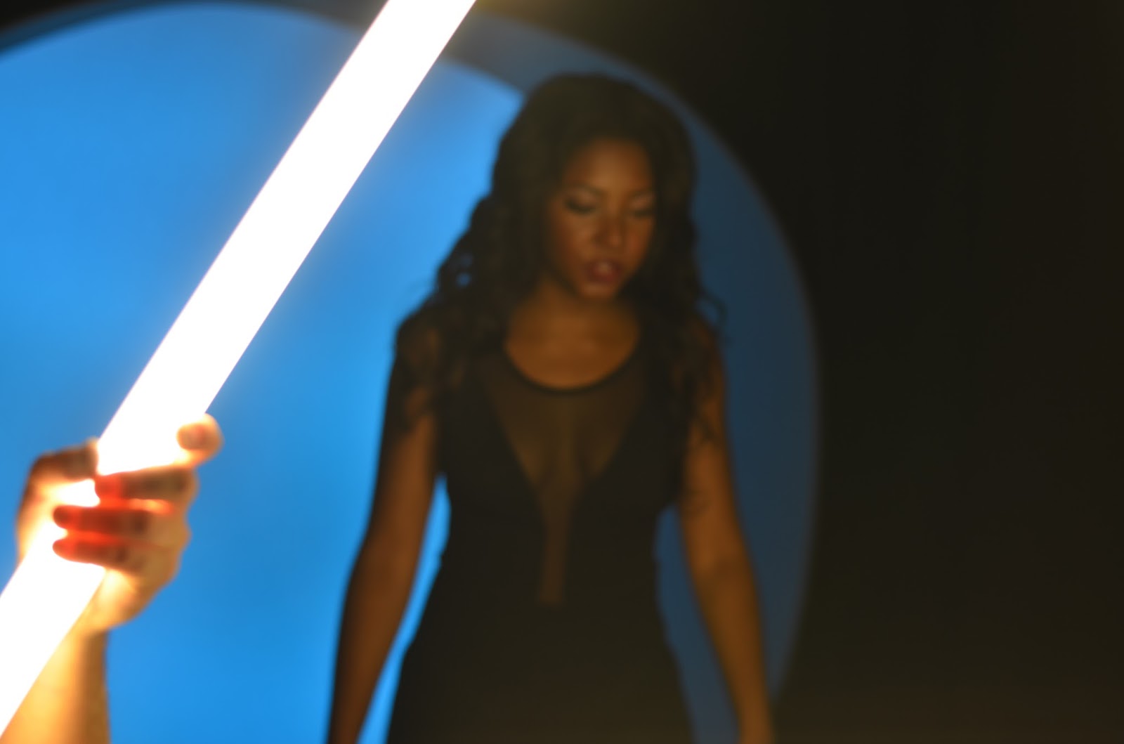
The studio was dark as it was surrounded by black out curtains. We had a big TV connected to the camera, to act as a monitor for the crew to see what was happening during filming. We made At 9AM, Whilst Nandi was getting makeup and hair and costumes on, we decided to do some shots with the dancers in the wheel. As this was silhouetted, we weren’t concerned about lack of makeup or hair on them at that time. We told them to do some striking poses and slow movements in the wheel. This also acted as test shooting/ extra footage. From this we could see how everything was going to look and help us take advantage of the time we had waiting for Nandi to be ready. I made sure that the shots were visually how we wanted them, in terms of composition and shot type. 


Nandi was ready to begin, we did one shot of her as a silhouette. We didn’t need an extraordinary amount of her silhouettes as we already had the dancers now. We produced more takes with her lip syncing, to help her warm up and get used to the whole filming process. 


  1. How did you divide the roles on your shoot day, what role(s) did you play?
We divided our roles pretty easily on the shoot day. I played the role of the cameraman, as I am the best with technology. Amr has a very creative eye, and knows how to create a performance. He was therefore the director. And lastly, Saskia was the art director and sound playback, as she is good at organising and getting everything to run smoothly. We all agreed that we would chip into each others roles, and contribute with our own personal opinions. For example, if Saskia was sorting something else out, I would run upstairs to see how Nandi is doing in makeup. Me and Saskia also contributed to what we would like to see performance wise. 


  1. What do you think that you personally did particularly well?
I think I personally organised the shoot day very well. As I had conversing with Jackie and our cast, I introduced them to the rest of the crew and reminded them what they were doing. I also contributed to the direction of Nandi, and gave her advice on performance, such as singing the lyrics and performing it like how she did on the test shoot.  

As cameraman, I think I meticulously looked at the framing and any problems very well. I would shout if Nandi's bodytape was exposed to the camera, or if her eyelash was falling off. These minor details would be very obvious in post-production and for the audience to see. 

I think I also organised costumes very well for the shoot day. I brought them all in a box, where I was keeping them in my house. And placing them out whilst explaining to our talent which is which. 

I was also responsible for behind the scenes. As they were changing sets or discussing performances before rolling, I would take a DSLR camera and shoot the behind the scenes pictures. I think I captured different parts of the music video process very well, as well as taking pictures of the talent for reference. 


  1. What problems did you have on the shoot day, how did you solve them?
We had problems in terms of timing. We had many sets and shots that we wanted to do, however, little time to do it. We thought it would be best to get the biggest elements out of the way, without sabotaging the shooting schedule. We therefore did the wheel first, especially as it needed to be destroyed immediately afterwards to allow more space in the studio. We got the most takes for the wheel.

Another time-related problem we had was the amount of sets we had. We realised we may not be able to do all of our sets in time. I suggested that the similarities between the dance elements and the screen, will allow us to scrap the screen element, and shoot the same element on the dance background. This worked in our favour, as we saved a substantial amount of time, rather than resetting and moving the set around.

There were smaller problems on our shoot day as well. Some involved continuity and wardrobe malfunctions. As I was watching carefully through the monitor on what was happening, I noticed these and quickly pointed them out, so they will be fixed before the next take. E.g. Eyelashes falling off, body tape exposed etc.

I also discovered half way through a dance take a peculiar spot, in what I thought was a lens flare. We cut the take and looked into what it was. The spot turned out to be on the camera itself and not the lens. Another spot had also arisen. We solved this by spraying the camera with high pressured air. We also discovered a dead cell on the camera.


  1. Which part of the shoot do you think was most successful and why?
I think the most successful part of the shoot was the wheel, which was fortunately our biggest element. We obtained plenty of footage from each girl, without many problems. The dance element was tricky with the spot of air and the florescent element we could not finish due to time. 


  1. Which part of the shoot do you wish had gone better and why?
I wish that the florescent element would have gone better. I wanted to spend more time than we had on this element, and get some more footage to play around with. We wanted to use the fan element and a long shot of Nandi in the florescent lights. We also wanted to get some other shots of Manu. We especially wanted a close up of his lips rapping, to give that mysteriousness and a different shot type to the rest. However, we ran out of time for this and began to rush the process to fit everything in.  


  1. How well do you think you managed your talent (actors)?
I think I managed our talent well. I made sure they had everything they needed to know. The dancers continued to practice and choreograph the dance, whilst I told Jackie what we wanted from makeup and hair. Amr was directing Nandi and Manu and telling them what to do when shooting, whilst I told Nandi to actually sing the words, and that it doesn't matter what it sounded like. This was so we could obtain the best possible lip syncing performance. 


  1. What was the part of the shoot you enjoyed the most?
I enjoyed setting up and shooting the wheel. I enjoyed watching the dancers silhouettes and doing different tracking close ups of their hands and feet. I think these will be very effective shots to use in post-production. 


  1. What are you looking forward to seeing the most in the edit?
I'm looking forward to seeing the footage that we have, and considering how I will assemble them together. I will use the storyboard and the timeline to aid me through this process. I am also looking forward to exploring what takes work together and cutting it to the beat. 


  1. How well do you feel that your production group worked as a team?
I feel that out production group worked extremely well as a team. We listened and respected each other's opinions, and we all sacrificed at least one of our suggestions to the others, in order to make the most effective music video as possible. On the day, we all conversed with each other and shared information, so that we were all on the same page. For example, we would ask each other if anyone had recently checked up on how Nandi or the dancers are doing in our waiting area. One of us would then volunteer to go and check.

 Right up to the shoot day, we were constantly communicating in a group chat, so that who had done what, and what we've prepared for was clear to all three of us. The allocation of the roles was also simple and easy to assign; especially as we knew we would all chip in our ideas and suggestions to each other's role, for example: Amr suggested to try some shots that he quite liked, whilst me and Saskia aided him in directing Nandi and what we collectively wanted her to do. We were also able to make quick decisions on shoot day. 


  1. Are their any lessons you learned today that could help you make your next shoot even more successful?
I think the biggest lesson we learnt is how to handle the pressure of time. We had many sets with little time to do so. I think to make our next shoot even more successful, we would make sure we get all the shots we wanted, and then get some extras that aren't as vital or necessary. 


  1. Are there any changes you might need to make to your website and artwork, in order for them to fit in with the video that you have shot?
I think there are no significant changes to be made to the rest of our campaign. We created the iconography and conventions we visualised well. One problem we had is the head falling off the snake on the armband. However, this is so insignificant and still looks like a snake. We will therefore continue with the snake iconography for the remaining campaign formats. 


BEHIND THE SCENES PHOTO GALLERY

↕Click the GIF below or the link above to view Behind the Scenes photo gallery↕

We have decided to go forth with Amr's design. We are adequate with this, as we have particularly included similar designs to each other in our individual work. Amr has incorporated the snake into the artwork and placed an element of it onto the CD.
Additionally, he has included the same concept as mine, where we take a bird's eye shot of the artist lying down.

We like the idea of the mid-long shot used as the front cover, as the audience can see her full body. Her costume is the same as what she wore in the music video. This presents her star image to an up-and coming star. She must show her full image to gain attention of the audience.


FRONT:

 INSIDE:


CD:


 BACK:


We have organised a photoshoot in the photography studio with Nandi, Laura Kennedy and Laura Smith (makeup). We are going to use the same costumes as the florescent element in the music video. We will need a black background. We will also use a fan on her, so her hair and outfit shows some movement on the photo. This is a convention used on many photoshoots, to make the subject look powerful and 'god-like'. 

Once this is done, we will use photoshop to create the snake and add the text. We will play with saturations and different effects to enhance the artwork and make it more visually pleasing. 


  • In preparation for creating our album artwork, we all individually created our own ideas and visions. This is my individual album design. Through our research of similar product, I found that it was particularly important to present the artist on the cover, so audiences value her star image. 

  • The style I am going for is a more synthetic R&B type of artwork. I replicated the technical conventions such as using a mid shot and keeping the framing simple. I am therefore sticking to the R&B genre of music, where artists are typically on their cover to present their star image. 

  • I plan to use a light shade of purple for the background and overall colour of the album. I feel like purple will compliment her star image well, and was incorporated into our music video such as the lip gloss. This shade of purple connotes a more sophisticated but still girly personality of the artist, as it is not a pink but not a masculine colour either. I was considering that there is more than song on this album, in which they vary in mood, style and theme. I think this shade is a good overall colour to use for the album, as it can represent all different kinds of tracks on the album. 


  • In addition to this, I have included similar symbolic conventions in the album that are present in our music video. In particular, I liked the idea of incorporating the snake into the artwork. This is present throughout her campaign, and becomes almost an iconography for her. This links to her star image of being constructed as mysterious and powerful. It effectively gives her a unique selling point for her target audience of 16-21 females. 

  • I think this design appeals to both her target audience and a male audience, as she is shown to be a powerful and sexy figure. She is wearing modern and up to trend outfits, along with her hair and makeup. The purple shade tells the target audience that she is a young artist, as it is a youthful colour associated with a younger generation. The composition is likewise very simple, suggesting that it is not a complex artist and therefore suitable for the younger audience. 

  • In this artwork, my artist is constructed as a feminine and sexy figure, but with power and confidence. The whole campaign is revolved around her, evident from the concept that she is the only subject in the album. She is associated with a snake, which turns into her iconography and almost a logo. Audiences will think of her and the snake to be sneaky, manipulative and dominant. From the symbolic conventions however, such as costume, she is shown to be fashionable, stylish and a very modern artist; keeping up with today's trends. 

  •  I have discovered that although technical conventions can  be more associated with other genres, it is the symbolic convention that defines which genre it is placed in. For example, I have used a close up, a typical technical convention seen in more acoustic genres. However, with the mise-en-scene of her hair, her eyes looking at the camera, and the background purple colour: these define the genre as a more pop-R&B genre.


FRONT:


INSIDE:


CD: 


BACK:


This is my process of creating my album artwork design. I took inspiration from several posters that I had come across when searching for poses and album products.


I began by observing what was on my screen and roughly drawing out what I could see. I kept in mind the technical and symbolic conventions that I wanted to present.  I considered using different iconographies with the artist, such as the snake, which was presented in our video. I also kept in mind that all designs must be simple and of the same photoshoot, to continue the theme and genre conventions across the digipak. 


So far I am happy with how these designs are coming on, and hopefully will be pleased with the final product. 

In preparation for our own album artwork. I looked at different conventions presented in album artworks of the R&B genre. I looked at 4 different artists: Beyonce, Mariah Carey, Mary J Blige and Drake.

Beyonce: Dangerously In Love (2003) At the start of the millennium, Beyonce was a rising solo star, known for her R&B music. She was a synthetic image, constructed to be a commodity. The target audience for this album is clearly a young age, shown by the conventions of the album artwork.

The technical conventions of this album cover is a mid-close up. We can only see her torso and up. The fact that it's not a close up, suggests that the star is an image for her target audience to see. The audience wants to see her appearance and what she looks like, as she supports Dyer's Star Theory of construction: she is an image to be sold to target audiences.  Albums that contain close ups generally belong to the acoustic genre.
Close up used for Adele's 21.

Her symbolic conventions show her to be against a baby blue background - targeting the male side of her audience. She is wearing a seductive crystallised tank top, revealing and supported with diamond earrings. These conventions of diamonds are associated with femininity and fun, as well as desirable and expensive. Beyonce is wrapped in diamonds in a more rebellious and scandalous way. These symbolic conventions suggest that she is classy, and desired, but can be mischievous and flirty. The font is placed in the corner of the artwork, to not take away attention from the image. It has a retro vibe, a popular trend back in 2003. It therefore suited the current trends at that time. The overall image is bright and clean. The image is simplistic but fills the album covers. The whole digipak uses the same colour scheme, along with the same photoshoot. This continues the clean cut and simple design of the artwork, suggesting that her image should not be complicated, as it's for a younger target audience.


 This is similar to Mary J Blige's album Growing Pains in 2007. The technical conventions sport a similar style of a mid shot. Likewise to Beyonce, Mary J Blige is also a constructed star image. However, she is less known as Beyonce and therefore emits a more organic image. This can be shown through the symbolic conventions. She is presenting a different look to Beyonce, one that is more mature, conservative, and sophisticated. This artist is therefore constructed within Dyer's theory as a more classy, grown up woman, who's target audience is a lot older than Beyonce's.

It is clear in the R&B genre that mid shots are used for the audience to see the artist, followed with a full wide shot on the back. In both Beyonce's and Blige's you see the same photoshoot (or photo in Blige's album) used but a different pose/shot. In a way, this continues the conventions they are trying to present, and do not need to confuse the viewer with different images. The images are very simple and clean, but fill the covers.
Furthermore, the artist and album title are placed subtly in the corner, with a more mature style of font to what Beyoncé used. This supports the idea that this cover is certainly aiming for a much older target audience.

The album contains a pink background, presenting the conventions of femininity and womanhood. However, it is a more vintage rustic pink than a baby colour like Beyonce's. This suggests that the artist is older, and a more organic act, as it doesn't try too hard to push her image to sell to the audience.


 Mariah Carey's album, however, is different to what we saw from Beyonce and Blige's. Although the concept of a photoshoot is still carried through, the technical and symbolic conventions differ greatly. Instead of a mid shot, we see a long shot, exposing her full body to the audience. We then see a close up of Carey for the back of the album. She is photoshopped onto an abstract sunset, where you can see through the orange clouds to meteorites and space. These conventions, along with the title 'Me. I am Mariah' suggests that the album is about her identity, and finding herself. Unlike Beyonce's and Blige's, Carey presents a more personal album cover to her. This clearly has an element of her identity in the artwork. 
However, in terms of Dyer's Star Theory, Carey is not as known as she once was many years ago. Her star image has slightly decreased as new artists pop up and become more known. It may be a possibility that she has therefore become more synthetic, as her constructed image is trying to re-sell to the audience. The fact we see her full body, in a seductive nude bodysuit, portrays her as sexy and confident, which will sell to her target audience. Likewise, in her close up, it looks like she is not wearing any clothes. This pushes the conventions of her as a feminine and admiring woman. 
The composition of the horizon is bold, which really stands out and catches a buyer's attention. The symbols of her posing on water infront of a horizon and space, connotes that she is a powerful woman, almost like a 'god'. Where the sky is her limit and she is her own boss. This supports her construction of being presented as a confident and powerful woman. 
In addition to this, unlike Beyonce and Blige's titles, which were placed in the corner; Carey's album title is placed in the center for viewers to read clearly. The title is important to the album cover, as it supports the concept of identity and is easy for the viewer to read. This relates back to her decreasing Star image, as she is trying to resell to audience buyers.


I noticed that although they are all in the same music genre, Drake's in particular stands out to me. It is a completely different style to all the others. The image simply consists of the top of a tower, with no album or artist title. Although Drake is one the cover (if you squint your eyes and look really hard), he is not being constructed as this image that is sold to an audience. Drake is one of the biggest artists in the current world, with his album 'Views' reaching number 1, along with multiple singles. Drake's star image is so big, he can be organic, and his appearance doesn't need to sell to an audience. The audience know that this album is Drake's, which is why there is no title on the front cover. Likewise, we do not need to see his appearance, as his music is the selling point. 
The technical conventions, interestingly are the same. It is also a mid shot, showing only an aspect of the tower. With a simple background and framing, the tower fills the cover. However, the colour scheme is different to the Ladies covers. Drake's is more grey and monotone, whilst the ladies are more colourful and catch the viewer's eye. Drake's music leans more towards the rap end of the R&B spectrum, and he is a male. He will therefore not be constructed with a colourful more 'pop-like feminine' end to the R&B spectrum. 
Furthermore, Drake's symbolic conventions of the clean grey theme continues to the rest of the digipak. The subtle grey cloudy pattern is sported on the back, along with simple and clean white font crediting the makers of the album and the song titles. 


Overall, the conventions of R&B music differ and depend on the Star Image of the artist. They usually present the symbolic conventions of a photoshoot of the artist, but a clean and simple composition. They tend to use fairly simple colours, as the buyer focuses on their appearance and doesn't want to be overwhelmed. If the artist is more well known, such as Drake during his album release, the image is more organic. Drake doesn't sell upon his star image, but his music instead. The solo female artists, such as Beyonce and Carey, do sell on their star image at that point of it's release. This explains their concept behind using a photoshoot for their album covers.


Today we began editing our music video. As we were the first group to shoot, we had the advantage of importing our footage from the camera card to the computer hard drive early. For the editing, we will use Adobe Premiere Pro.

We got started immediately, as we knew we had a large number of rushes than needed sifting through and syncing up. We recognised this process will take a long time for us due to the amount of footage and the particular difficulty of cutting to our track. The track has multiple different beats that you can possibly cut to.


We already had the cut digital copy of our track and placed into our project, along with the digital clapper.

The clapper was an extremely useful tool for syncing up our shots. It allowed us an audio and visual guideline for where the shots should sync against the digital track.

I began syncing up all 50 rushes, including the outtakes and bad shots. This is to save a significant amount of time in the editing process, as I can just focus on editing instead of syncing up further into the process. To sync up: I must find on the last number a solid digit that is clear. I must then find the same last digit on the footage. This is where our playback role comes into action on shoot day. Once found the same solid digit, I then pressed 'I' on the keyboard to cut in, and select the video icon underneath to drag video only onto the timeline. I placed it where my tracker is on the timeline. (the blue line)


This took a very long time to do all 50 rushes, particularly as some shots didn't have matching clear digits; however, this is a vital step for lip syncing. Without the accurate lip syncing, the video will not be effective in creating an illusion that the artist is singing live.


In preparation for the shoot day, we had selected roles in which we needed to allocate to each individual of our group. The roles were Director, Cameraperson, Art Director, Producer and Sound/Lighting desk. I was allocated the role of Cameraperson.

To prepare for this role, I did some research into what it means to be a cameraperson on music video sets and the responsibilities that I must take on.

The overall job of a cameraperson on a music video project is to capture footage and create shots that are as visually striking as possible. With music videos, there is no technical conventions previously set up that you must follow, you can do anything. Angles and lenses can be as extreme as you like them, which wont wear the viewer out as they only last for a few seconds in a three minute video.

Every shot must contain the maximum amount of information as they are shown in such a little amount of time. This means finding the best shots and lenses for every single shot.

Camera Operators are responsible for making sure that the camera and equipment are prepared for the required set-ups and ready for any last-minute problems and changes
This means placing the tripod in the right place, working out what lens is needed depending on the distance and type of shot required. The lens will then be attached and settings must be adjusted such as white balance, aperture and focus. On the blackmagic camera, which we will be using, there is a peak setting where the focused areas will have a green outline to show that it is at its most focused.

Once rolling, if a tracking shot, I will be responsible for panning/tilting the camera to follow the action as smoothly as possible, and carry out the director's visions.


Newer Posts Older Posts Home

CROESO

Ella's Hurtwood House Media Blog

POPULAR POSTS

  • Camera Angles/Shots/Movements
    Establishing Shot:   Usually the first shot of a scene. Lets audience know where action is taking place. Usually a very/extreme wide shot. ...
  • Music Video Analysis: Madonna's Like a Prayer
                                Madonna's hit single "Like a prayer" was released in 1989, a time of racial and religious order a...
  • Studio Lesson 2
    STUDIO LESSON We began with learning about the 180 degree rule. We saw a demonstration of a motorbike traveling across a road to visua...
  • Studio Camera Lesson
    Last week we learnt about the different cameras used in media, and how they function to get the best possible setting. We first explored the...
  • Researching Musical Styles and Campaigns: Meghan Trainor
  • Types of Thriller Sub-genres
    Thriller is a genre that uses excitement, suspense and tension as its key elements. Aviation : A thriller that is set on an air flight, ...
  • Preliminary Lip Sync Exercise
    For our preliminary task, we created a short music video to Meghan Trainor's All about that Bass, which is a quirky upbeat and catchy ...
  • Thinking about the Target Audience
    For my groups artist, we have decided the target audience to be 16-21 females. The artist is a confident, feminine figure similar to pres...
  • Use of sound in thriller/horror films
      The Woman in Black (directed by James Watkin in 2012) would typically be classed as a horror film or a paranormal thriller. Likewise, ...
  • Looking at Websites: Ariana Grande
    I began looking at websites as a component of music campaigns. I compared the websites of Ariana Grande and Rihanna, both very popular arti...

Featured Post

AS Thriller

This is our final media product titled 'The Salvatore'

Blog Archive

  • ►  2017 (10)
    • ►  February (2)
    • ►  January (8)
  • ▼  2016 (166)
    • ►  December (14)
    • ▼  November (13)
      • Shoot Day evaluation
      • Behind The Scenes
      • Final Design
      • Individual Album Artwork
      • Album artwork process
      • Looking at Album Artwork
      • First editing session
      • Role of Cameraperson
      • Shot List
      • More problems with Dancers
      • Updates on set
      • Looking at lighting
      • Problem with our dancer
    • ►  October (56)
    • ►  September (24)
    • ►  August (2)
    • ►  June (7)
    • ►  March (16)
    • ►  February (13)
    • ►  January (21)
  • ►  2015 (24)
    • ►  December (7)
    • ►  November (4)
    • ►  October (7)
    • ►  September (6)

Search This Blog

Pages

  • Home
  • BLOG ARCHIVE
  • EVALUATION

About Me

Popular Posts

  • Camera Angles/Shots/Movements
    Establishing Shot:   Usually the first shot of a scene. Lets audience know where action is taking place. Usually a very/extreme wide shot. ...
  • Music Video Analysis: Madonna's Like a Prayer
                                Madonna's hit single "Like a prayer" was released in 1989, a time of racial and religious order a...
  • Studio Lesson 2
    STUDIO LESSON We began with learning about the 180 degree rule. We saw a demonstration of a motorbike traveling across a road to visua...
  • Studio Camera Lesson
    Last week we learnt about the different cameras used in media, and how they function to get the best possible setting. We first explored the...
  • Researching Musical Styles and Campaigns: Meghan Trainor
  • Types of Thriller Sub-genres
    Thriller is a genre that uses excitement, suspense and tension as its key elements. Aviation : A thriller that is set on an air flight, ...
  • Preliminary Lip Sync Exercise
    For our preliminary task, we created a short music video to Meghan Trainor's All about that Bass, which is a quirky upbeat and catchy ...
  • Thinking about the Target Audience
    For my groups artist, we have decided the target audience to be 16-21 females. The artist is a confident, feminine figure similar to pres...
  • Use of sound in thriller/horror films
      The Woman in Black (directed by James Watkin in 2012) would typically be classed as a horror film or a paranormal thriller. Likewise, ...
  • Looking at Websites: Ariana Grande
    I began looking at websites as a component of music campaigns. I compared the websites of Ariana Grande and Rihanna, both very popular arti...

Advertisement

Copyright © 2016 Ella's Media Studies Blog. Created by OddThemes